


 Your new post is loading...

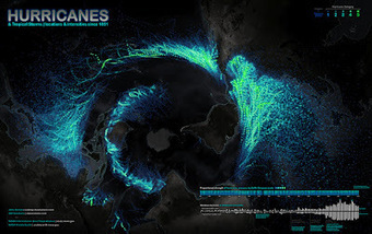

A few days ago, I tweeted about the beautiful map shown- Hurricanes and Tropical Storms since 1851. I added a note about the projection, which may be unusual for someone who was born in Europe, the US, or Continental Asia, as it is centered on the South Pole. Rob Simmon, a data visualizer at NASA Earth Observatory, replied: "I disagree with the map projection choice, far too much distortion of the data, especially in the Northern Hemisphere." That's a legitimate concern. Distorsion is a major challenge when designing maps.
I gave Rob's comment some thought, as it is somehow related to the core idea in The Functional Art: Information graphics are tools; before choosing visual shapes to encode data we should define the tasks our graphics should help readers with.
Additionally, in interactive visualizations we may want to explore information from different angles. In the video lectures that you get with the book, I point out that designers usually forget that sometimes it may be necessary to represent data more than once, with different kinds of charts, maps, and diagrams, each adapted to a particular function...
Via Lauren Moss


