

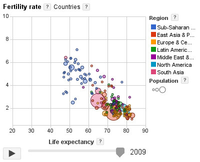

The Google Public Data Explorer makes large datasets easy to explore, visualize and communicate. As the charts and maps animate over time, the changes in the world become easier to understand.
Via Patty Ball
Get Started for FREE
Sign up with Facebook Sign up with X
I don't have a Facebook or a X account


 Your new post is loading...
 Your new post is loading...
Your new post is loading...
The Google Public Data Explorer makes large datasets easy to explore, visualize and communicate. As the charts and maps animate over time, the changes in the world become easier to understand. Via Patty Ball 
No comment yet.
Sign up to comment
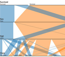
For many data visualization projects, information comes from a source that has already done some aggregation. This is both a blessing and a curse. Aggregation definitely simplifies the analysis and visualization process, but it can also greatly reduce the visualization and analysis options. This is because aggregation often destroys connections in data. For this reason, it's critical to have an in-depth and thorough knowledge and understanding of the information from aggregated information. There are several different visualization techniques that open up once we have the original data, such as Euler diagrams and parallel sets.
The extra information that can be obtained from visualizations is important to gaining a full understanding of the data, and it can lead to a much more interesting story, as well as far better visualizations and more accurate connections and links within those visualizations. So, when gathering data about something, remember to dig deeper into it, as there are many important connections that happen within data that can provide knowledge beyond just a simple average or total.
To learn more about the value of these connections, sourcing accurate data, and how it is transformed into useful graphics, read the complete article and check out the case study used to convey the main points outlined above... Via Lauren Moss

kurakura's comment,
November 15, 2012 5:17 AM
the last graph on that page is really useful for understanding the data?
|

Even for the most direction-savvy New Yorker, emerging from the dark pit of the subway can be a disorienting experience. New York City streets are bright, they’re loud, oftentimes they’re smelly, and worst of all, maps are virtually non-existent. Or at least that used to be the case.
Just this week, the Department of Transportation unveiled its WalkNYC initiative, a program that will bring comprehensive pedestrian maps to all five boroughs. In a city where an estimated 30 percent of all trips are made by foot and one out of every three locals can’t tell north from south, they’re probably going to come in handy.
Though NYC’s public transportation is top-notch and we are technically on a grid, it’s easy to get lost or overwhelmed when traveling by foot. That’s why the DOT enlisted the help of PentaCityGroup, a consortium of urban planners, engineers, designers, cartographers and geographical information specialists, to solve the problem. Their goal? To create an information-packed map that would orient pedestrians and help them find the gems each NYC neighborhood has to offer. The first of these new information kiosks was installed earlier this week in Chinatown (they’re already located at every Citi Bike station), and it’s expected that others will be popping up in midtown Manhattan, Long Island City in Queens and Prospect Heights in Brooklyn this summer Via Lauren Moss

luiy's curator insight,
July 3, 2013 8:49 AM
If the style of these maps looks familiar, that’s because it is. The design team wanted to marry the current design to the graphic language that was was established for the subway system in the late 1960s. The typeface is still Helvetica (albeit with a slight twist–the type’s square dots are now round) and it uses the same organizational conventions (white type on a dark background). “All of this was deliberately echoing the way the subways look,” Bierut explains. “We wanted people to be able to ride the subway, come out and orient themselves.” Bierut says the design of the maps is meant to be accurate, trustworthy and friendly. But not too friendly—this is New York City, after all. “We wanted these things to be beautiful in a way, but also characteristic of the best of New York.” |


