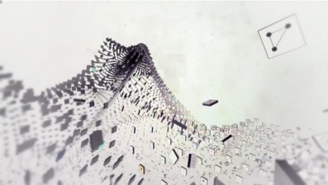
Information visualization is all the rage recently with everyone trying to turn their data (or any data really) into a beautiful piece of art. Typically most of these projects fail at doing justice to the data they’re trying to visualize.
Enter data hero Michael Rigley, BFA of California College of the Arts’ graphic design program. His data visualization animation is does truth to the numbers in his piece about tracing what happens to the data that we spew into the digital landscape every day. Take a look at some of the sample screens from his animation and be sure to catch the video.
Via Lauren Moss


 Your new post is loading...


