information analyst
43.8K views | +2 today
Follow
information analyst
km, ged / edms, workflow, collaboratif
Your new post is loading...
Rescooped by michel verstrepen from visual data
Scoop.it!

What The Internet Would Look Like As A World Map

What The Internet Would Look Like As A World Map | information analyst | Scoop.it
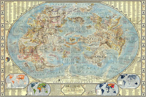
An artist has created a hand-drawn map of the Internet, where Google, Apple, and porn are continents.

The world of the Internet mirrors the real-world in myriad ways: there are members (we call them populations), websites (destinations to visit), acquisitions of companies (redrawn political boundaries). So what if the Internet could be visualized like our global politics?

That’s exactly what designer Martin Vargic did in this cartographic experiment which treats mega-companies such as Google, Microsoft, HP, and Apple like empires, on a classic world map. To explain the dominance and relationships of these entities, Vargic created a visual hierarchy that gives prominent treatment to companies with the most users (or sites with the most visitors), surrounding them with smaller states and townships named after adjacent businesses.


More details at the link...


Via Lauren Moss
No comment yet.
Rescooped by michel verstrepen from visual data
Scoop.it!

NYC's Innovative New Map System Won't Leave You Lost

NYC's Innovative New Map System Won't Leave You Lost | information analyst | Scoop.it

Even for the most direction-savvy New Yorker, emerging from the dark pit of the subway can be a disorienting experience. New York City streets are bright, they’re loud, oftentimes they’re smelly, and worst of all, maps are virtually non-existent. Or at least that used to be the case.


Just this week, the Department of Transportation unveiled its WalkNYC initiative, a program that will bring comprehensive pedestrian maps to all five boroughs. In a city where an estimated 30 percent of all trips are made by foot and one out of every three locals can’t tell north from south, they’re probably going to come in handy.


Though NYC’s public transportation is top-notch and we are technically on a grid, it’s easy to get lost or overwhelmed when traveling by foot. That’s why the DOT enlisted the help of PentaCityGroup, a consortium of urban planners, engineers, designers, cartographers and geographical information specialists, to solve the problem.

Their goal? To create an information-packed map that would orient pedestrians and help them find the gems each NYC neighborhood has to offer. The first of these new information kiosks was installed earlier this week in Chinatown (they’re already located at every Citi Bike station), and it’s expected that others will be popping up in midtown Manhattan, Long Island City in Queens and Prospect Heights in Brooklyn this summer


Via Lauren Moss
luiy's curator insight, July 3, 2013 8:49 AM

If the style of these maps looks familiar, that’s because it is. The design team wanted to marry the current design to the graphic language that was was established for the subway system in the late 1960s. The typeface is still Helvetica (albeit with a slight twist–the type’s square dots are now round) and it uses the same organizational conventions (white type on a dark background). “All of this was deliberately echoing the way the subways look,” Bierut explains. “We wanted people to be able to ride the subway, come out and orient themselves.” Bierut says the design of the maps is meant to be accurate, trustworthy and friendly. But not too friendly—this is New York City, after all. “We wanted these things to be beautiful in a way, but also characteristic of the best of New York.”

ParadigmGallery's comment, July 8, 2013 4:02 PM
great...can't wait to try these...