


Information graphics and the fight for science in Trump’s America
Get Started for FREE
Sign up with Facebook Sign up with X
I don't have a Facebook or a X account


 Your new post is loading...
 Your new post is loading...
Your new post is loading...
Information graphics and the fight for science in Trump’s America 
No comment yet.
Sign up to comment

"An Interactive Graphic Showing The Evolution of Western Dance Music Over The Last 100 Years in Under 20 seconds..."
Excellent visualization of diffusion as well as cultural syncretism in the pop cultures affiliated with globalization.
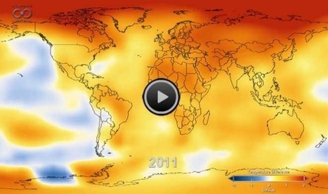
An amazing 26-second video depicting how temperatures around the globe have warmed since 1880. This quick visualization is a excellent summary of the data of anthropogenic climate change. Via Nathan Phillips

Kenny Dominguez's curator insight,
December 12, 2013 1:09 AM
I wonder why the climate is changing so much it seems to be devastating. It can probably affect a lot of people because many people depend on a certain type of weather to grow food or do anything else that involves the weather like going for a swim in a pool or lake. The weather is something that many people need and depend on. Many people want the heat because they cant be in a cold area or vise versa. 
Liam Michelsohn's curator insight,
December 12, 2013 7:13 PM
A great visual dispay showing how tempetures have flucuated over the past 130 years and the futer implications of climate change today. Thoughout the video it shows how the tempeture is chaging (rising and falling) all acorss the board. However you cleary see at the end that tempeture stop flucuating and only contiues to rise. While over all it is only a 1 or 2 dagree differnce, its clear that if we go 80 years with a stable tempture and then it starts to only get warmer that weve got a climate change problam on our hands.

Amazing animated infographic look at various world statistics in Oceania vs. Europe vs. America vs. Africa vs. Asia, from population to homicides to number of billionaires – a fine example of how to...
The video doesn't have captions to denote which continent is which, otherwise this is an excellent data visualization of global and regional differences, using the theme of the Olympics as it's symbolic motif.
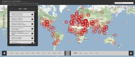
Browse the timeline of war and conflict across the globe.
This database of global wars and conflicts is searchable through space and time. You can drag and click both the map and timeline to locate particular battles and wars, and then read more information about that conflict. This resource would be a great one to show students and let them explore to find what they see as interesting. This site is brimming with potential.

olsen jay nelson's comment,
August 16, 2012 7:46 AM
This is just what I've been looking for, believe it or not:-)

Paul Rymsza's comment,
August 22, 2012 2:15 PM
the potential of this site is amazing between the interactive learning system and the correlation between the timeline and location. If the human geography class is anything like this i can't wait for it!
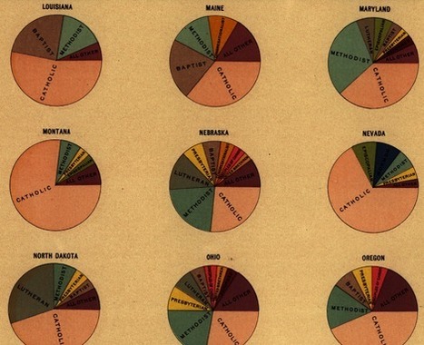
Do you want some inspiration to create a visually stunning - yet fully optimized - data graphic? Well, let's go back about a 140 years... Handsome Atlas developed by Jonathan Soma of Brooklyn Brainery, provides a stunning new online interface to a large collection of beautiful data visualizations from the 19th century.
TR: Taking into account the age of these visualizations, one has to wonder if they intended them to be used by our generation in this way. I see potential for a "web 2.0" update of these charts to make them interactive . . .
Tags: infographic, historical, visualization, statistics.
|

Visualization is a technique to graphically represent sets of data. When data is large or abstract, visualization can help make the data easier to read or understand. There are visualization tools for search, music, networks, online communities, and almost anything else you can think of. Whether you want a desktop application or a web-based tool, there are many specific tools are available on the web that let you visualize all kinds of data.

Digital tools have faciliated an easier way to visually represent complex data and information in ways at are logical and intuitive. This blog post outlines tools that students can use (read: free!) along with basic tutorials to demonstrate their functionalities.
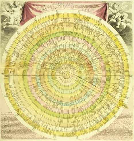
Selections from Daniel Rosenberg and Anthony Grafton’s captivating history of timelines, now in paperback—from time circles to time dragons, to a history of civilization drawn on a single piece of paper.
How do we spatially organize time to give it a visual representation that is somewhat intuitive? This fascinating gallery portrays various attempts throughout the centuries of how historians have mapped out their historical narratives.
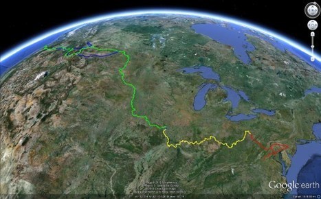
Amazing things about Google Earth - news, features, tips, technology, and applications...
If you've never seen the Google Earth Blog, this post is a good primer to the educational possibilities that this technology opens up to teachers. It is not just for geography teachers; it can be a visualization tool for any subject that has real-world applications that take place somewhere.
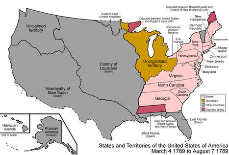
Amazing work from wikipedia, summarizing the evolution of the US formation, originally here: http://en.wikipedia.org/wiki/Territorial_evolution_of_the_United_States
Tags: USA, historical, visualization.
|


