


 Your new post is loading...

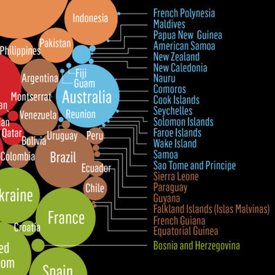

As Sustainability month draws to a close, we've dug up a gem from the Coroflot archives: Stanford Kay's excellent infographic of global carbon emissions.
Kay's design succeeds in representing a potentially overwhelming set of data on several levels: some 200+ different countries are represented by bubbles, color-coded by continent, where the size of each is proportional to its carbon emissions.
Moreover, the arrangement of the bubbles completes the metaphor, adding a further dimension of scale to the graphic: it is difficult, if not impossible, to see the big picture when one is perusing the names of the individual countries. Thus, Kay's infographic also reminds us not to miss the forest for the trees.
Via Lauren Moss


