 Your new post is loading...
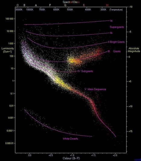
In our Data Visualization 101 series, we cover each chart type to help you sharpen your data visualization skills.Scatter plots have been called the “most versatile, polymorphic, and generally useful invention in the history of statistical graphics” (Journal of the History of the Behavioral Sciences, 2005). That’s a big claim, but just as their name implies, they can take a confusing and scattered set of data and make sense of it. As such, these plots are much more than a visualization tool; they are a discovery tool. Let’s look at what makes the scatter plot so good...
Via Lauren Moss
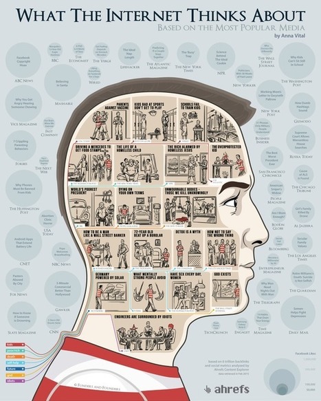
What does the Internet care about? What articles do we share the most? Using the data from the Ahrefs Content Explorer, the people at Funders and Founders
Via Lauren Moss
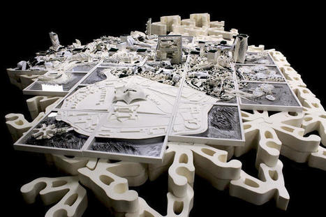
In 1939, visitors stood in line for hours to see the Futurama exhibit at the New York World's Fair, a detailed model imagining 1960s America. Complete with half a million tiny buildings and a million handmade miniature trees, it also visualized a network of highways crossing the country. And while the interstate system probably would have been built without it, it's arguable that the visualization—sponsored by GM—helped the roads happen. A new exhibit called the Future City, up now at London's Royal Institute of British Architects, looks at how drawings and models of futuristic cities can shape the cities that actually are built. "Visualizations of future cities contribute to our collective imagination," says Nick Dunn from Lancaster University "They provide us with visionary projections of how we might live. Reexamining these from a historical perspective can give us new insights and greater understanding of the developments and patterns that shape the present, and in turn, their implications for our future."
Via Lauren Moss
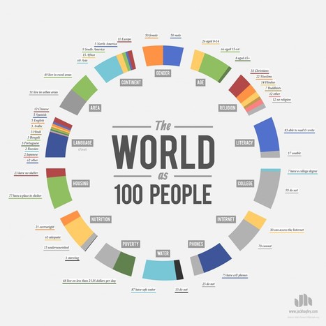
The World as 100 People. This idea has been around since 1990. This is my attempt at presenting the information.
Via Beth Dichter
"In order for our learners to see how designing information changes how it is viewed, the students this year placed their visual infographics side-by-side with their linear notes to see the transformation. It was the “ah ha” moment, when they could examine how the delivery of content mattered and how the deliberate choices in font hierarchy, color selection, and placement changed the way others perceived the ideas."
Via Beth Dichter
'About a year ago, we published a blog post framed as a letter to NASA, asking them to stop using rainbow color scales. The post was written out of a general frustration with rainbow color scales, but especially out of seeing field experts and leaders, like NASA, using a perceptually incorrect color scale. We weren’t alone.
Robert Simmon from NASA’s Earth Observatory has been crusading for the same changes. He’s made great progress, and as a continuation of that, he’s responding to our “letter” with a brilliant series of blog posts on proper use of colors and color scales.'
Via Lauren Moss
We are living in the information age. The amount of information stored, transfered, and processed is growing at a staggering rate.
From the common megabyte to the mind-boggling yottabyte, this infographic serves as a guide to understanding the world of bytes!
Via Lauren Moss
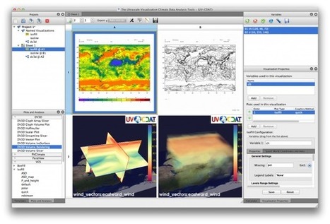
Data is everywhere and well-designed data graphics can be both beautiful and meaningful. As visualizations take center stage in a data-centric world, researchers and developers spend much time understanding and creating better visualizations. But they spend just as much time understanding how tools can help programmers and designers create visualizations faster, more effectively, and more enjoyably. As any visualization practitioner will tell you, turning a dataset from raw stuff in a file to a final result in a picture is far from a single-track, linear path. Rather, there is a constant iteration of competing designs, tweaking and evaluating at once their pros and cons. The visualization research community has recognized the importance of keeping track of this process. Read the complete article to learn more about the future of the practice and the tools that enable designers to create thoughtful infographics and visualizations...
Via Lauren Moss
|
Ever wonder how many meteors have hit Earth? The Meteoritical Society is doing its best to keep track. And Javier de la Torre, co-founder of CartoDB, is helping us see the pure volume of hits (into the tens of thousands). His interactive visualization shows a heatmap of hits all over the world, letting you explore where and when meteorites fell, as well as their size and classification.
Via Lauren Moss
Temple University researchers recently put together the world's largest tree of life visualized across time. The family tree of living and extinct organisms encompasses 50,000 species—only a fraction of the world's history of life—and would easily take up hundreds of pages if laid out linearly. To fit their work onto a printed page, the researchers, led by evolutionary biologist S. Blair Hedges, instead decided to visualize the data as a spiral.
Via Lauren Moss
"Procrastination is definitely not our friend. It makes us randomly search the web, watch funny youtube videos or constantly check twitter stream instead of doing things that matter. It kills our time and leads to failure. Now it's time to beat it! Here are 15 efficient techniques to get rid of procrastination and be more productive!"
Via Beth Dichter
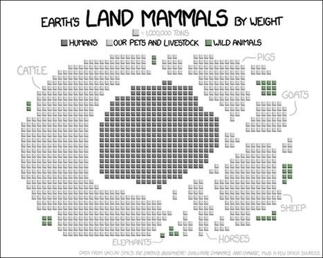
Randall Munroe, a former NASA roboticist who nows draws clever geeky webcomics at XKCD, used data from Vaclav Smil's The Earth's Biosphere: Evolution, Dynamics, and Change ("plus a few other sources") to create a visualization of all of Earth's land mammals, which include us, by weight. It does certainly put things in perspective, especially when you compare wild land mammals to us and our livestock and pets.
Via Lauren Moss
Social-media platforms like FourSquare and Twitter have been a boon for sociologists and geographers who now have entirely new ways of tracking how we move through cities, where we go, who we are, and even what we think of the world around us. There is one set of social-media platforms, however, that has been tougher to crack for useful data than others: photo-sharing sites.
Their metadata can illustrate where people take photos, and how active they are. But on the whole, how do you aggregate useful data about entire cities and the differences between them from the content of millions of photos on a site like Instagram? Researchers have been working on this for the past year, and they've just posted some of the initial results from their Phototrails project here.The project is less an exploration of a specific research question, and more a first foray into what we might learn by treating user-generated photography as another source of Big Data.
Via Lauren Moss
A demographic portrait of humanity if the world were 100 people.
From data source, 100people.org: The world population has now reached 7 billion people. This milestone inspired us to conduct research to update our statistics, and the changes over the past 5 years are remarkable. In 2006, only 1 person out of 100 would have had a college education-- today that number has jumped to 7 thanks in part to advances in higher education in Asia. The detailed research and source information can be found here and the statistics provided by Donella Meadows in 1990 that originally inspired our project can be viewed here.
Via Lauren Moss
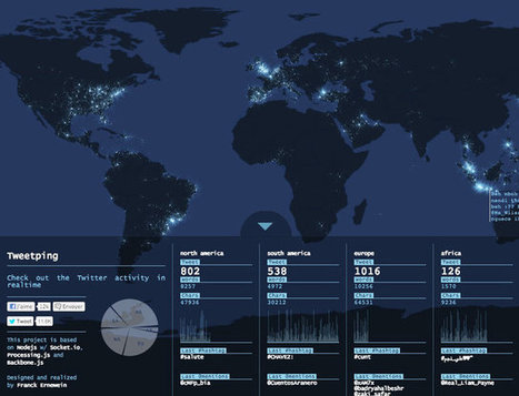
By Franck Ernewein, Tweetping is a map that shows where everyone in the whole world is tweeting from in real time.
Much like Poptip’s treatment of Twitter, you’re not really meant to follow it all. Country-by-country tickers do track the total tweets, words, and characters sent since you signed on, but hashtags and @-mentions flash for milliseconds, constantly replaced by a stream of data that can’t be paused for a moment, lest the system fall perpetually behind. Meanwhile, the geolocations of each tweet make their way to a world map as a glowing dot. As the tweets pile up, so do the dots, meaning the world transforms from prehistoric shadows to blindingly bright connectivity in a matter of minutes.
Via Lauren Moss
|


![Bytes Sized: Information Storage, Visualized [infographic] | Design, Science and Technology | Scoop.it](https://img.scoop.it/6SHxhn215FCrc0rwyp7qzTl72eJkfbmt4t8yenImKBVvK0kTmF0xjctABnaLJIm9)


![15 Ways to Beat Procrastination [Infographic] | Design, Science and Technology | Scoop.it](https://img.scoop.it/V_0yRgNYaZ3673C8kZ5SRjl72eJkfbmt4t8yenImKBVvK0kTmF0xjctABnaLJIm9)


aggiungi la tua intuizione ...
A quick history of graphing information and how scatter plots are unique from other ways of graphing in more than one way. A great visual of the different types of relationships that are easily identified on a scatter plot, highlighting why scatter plots are so useful to understand relationships between two different variables.