Design, Science and Technology
45.7K views | +0 today
Follow
Design, Science and Technology
#ideas #design #science #technology #inspiration #media #information
Your new post is loading...
Rescooped by Antonios Bouris from visual data
Scoop.it!

How to Tell a Powerful Story with Data Visualization

How to Tell a Powerful Story with Data Visualization | Design, Science and Technology | Scoop.it

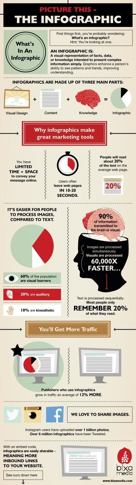
In the age of Big Data, folks are often overwhelmed by the volume of data sources, charts, and graphs thrown at them every day. Enter data visualization – the ability to condense, analyze, and share data that makes an impact. Throughout history, data visualization has been used to document everything from health crises to the effect of colors on mood.

But what exactly does data visualization do and how can you leverage it to grow your business? Are data visualization and infographics the same thing? Read on to learn more, plus discover some fascinating examples.


Via Lauren Moss
Chris Biddy's curator insight, October 28, 2014 4:30 PM

Very insightful look at the what, how and so what of data visualization. Another example of how a good visualization makes data digestible!

Marco Favero's curator insight, October 28, 2014 4:52 PM

aggiungi la tua intuizione ...

Rescooped by Antonios Bouris from visual data
Scoop.it!

An Infographic About Infographics

An Infographic About Infographics | Design, Science and Technology | Scoop.it

A picture is worth a thousand words, and Californian digital marketing agency, Bixa Media, have illustrated (pun intended) by creating an infographic about the importance of… well, infographics.


Based on the company’s research and insights, they found that visual data is absorbed 60,000x faster than text and people will only read about 20% of the text on a page.


Via Lauren Moss
No comment yet.