


Research and publish the best content.
Get Started for FREE
Sign up with Facebook Sign up with X
I don't have a Facebook or a X account
Already have an account: Login

Design, Science and Technology
45.7K views |
+0 today
#ideas #design #science #technology #inspiration #media #information
Curated by
Antonios Bouris
 Your new post is loading... Your new post is loading...
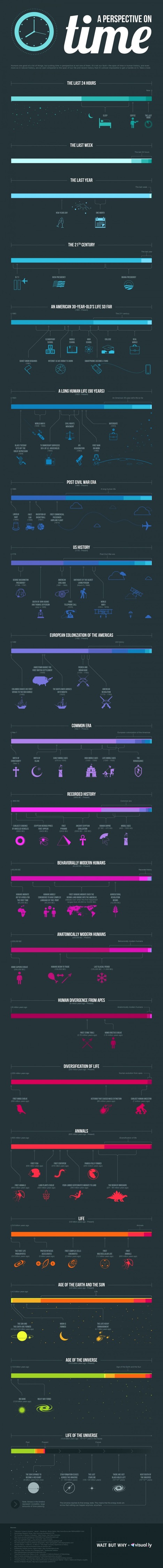
'Humans are good at a lot of things, but putting time in perspective is not one of them. It's not our fault - the span of time in human history, and even more so in natural history, are so vast compared to the span of our life and recent history that it's almost impossible to get a handle on it.' View the information sources and data here. Via Lauren Moss 
|

An EU-funded project is building platforms to detect patterns in how people use urban spaces.
Maps don't typically convey time very well. They're static snapshots of a moment in history. A handful of animated maps that do a good job combining time and space using either transit data or geo-tagged social-media hits. Now a new project, called Geographies of Time, is trying to do something similar with a more typical two-dimensional map. The effort is part of a broader EU-funded projects called UrbanSensing that's building platforms to detect patterns in how people use urban spaces. Via Lauren Moss

luiy's curator insight,
November 28, 2013 6:21 AM
Giorgia Lupi, the Ph.D. researcher at Milan Politecnico behind the project, began with Milan. Using tens of thousands of geo-tagged tweets, she and colleagues divided the map of the city into a fine-grained grid. The tweets were then divided into eight three-hour time intervals (from midnight to 3 a.m., 3 a.m. to 6 a.m., etc.). And the boxes in the grid were digitally colored based on the time window when Twitter was locally most active. 
nuria font-casaseca's curator insight,
April 24, 2014 9:21 AM
Les ciutats i els temps: com ens movem per la ciutat en funció de l'hora i el dia.
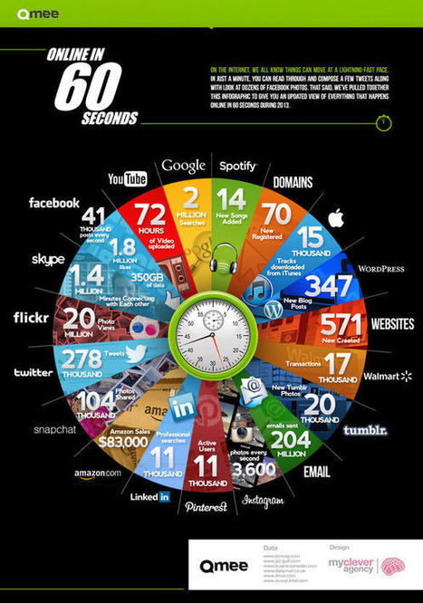
Early last year we learned that one hour of YouTube is uploaded every second. It was a bracing reminder of just how many people are spending their time online simultaneously.
Created by rewards site Qmee, the infographic "Online In 60 Seconds" is a pie chart that shows off the sheer amount of online activity that takes place every single minute. The amount of YouTube videos uploaded has already increased from January 2012's 60 hours per minute to 72. Additionally, over 1.8 million things are liked on Facebook, and 278 thousand bon mots tweeted. Not depicted in the chart: the amount of work that is going undone while all of these items are being viewed. Via Lauren Moss

Angie Thao's curator insight,
May 15, 2016 7:06 PM
Single Chart Infograph: Like: Good visual, good data. Dislike: Can be a little overwhelming to look at. |


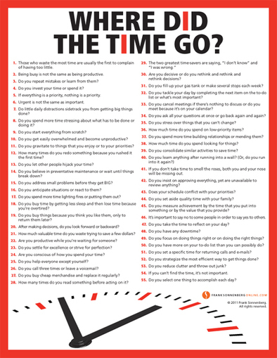
55 Valuable Tips to Save Time