


Creating a color palette with your favorite music.
Color and music are both about evoking emotions; why not combine them? This infographic shows beautiful abstract visualizations, based on color palettes inspired by each album.
Via Lauren Moss
Get Started for FREE
Sign up with Facebook Sign up with X
I don't have a Facebook or a X account


 Your new post is loading... Your new post is loading...
Creating a color palette with your favorite music. Color and music are both about evoking emotions; why not combine them? This infographic shows beautiful abstract visualizations, based on color palettes inspired by each album. Via Lauren Moss 
|
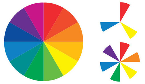
Sometimes the toughest step in building a new website or redesign can be the conceptual ones. Selecting a color palette is one of them that can be tough if you don’t have the right tools. So where do you start?
It all comes down to basic color theory and the color wheel. That same tool that teachers used in school really is the basis for how designers plan and use color in almost every project from the simplest web page to expansive brands with multiple sites and campaigns... Via Lauren Moss
|


Couleurs et Musiques évoquent des Émotions, cette infographie fait le lien entre les trois !
This is amazing the correlation between sound and color translated into actual songs
Data Visualization Infograph
Strength: Easy to follow and to understand, catches eye
Weakness: Not that much data on it, usually can only comfortably fit one or two pieces of data