


'Taste the Feeling' is Coke’s new global marketing campaign. See the ads and hear the music here.
Via Sylvain Leroux
Get Started for FREE
Sign up with Facebook Sign up with X
I don't have a Facebook or a X account


 Your new post is loading... Your new post is loading...
'Taste the Feeling' is Coke’s new global marketing campaign. See the ads and hear the music here. Via Sylvain Leroux 
No comment yet.
Sign up to comment

Ever wonder how many meteors have hit Earth? The Meteoritical Society is doing its best to keep track. And Javier de la Torre, co-founder of CartoDB, is helping us see the pure volume of hits (into the tens of thousands). His interactive visualization shows a heatmap of hits all over the world, letting you explore where and when meteorites fell, as well as their size and classification. Via Lauren Moss

AnalyticsInnovations's curator insight,
June 5, 2015 7:09 AM
Example of data scientist faux pas: Meteors choose to fall so unevenly...!

A new interactive tool estimates the economic, urban, and demographic risks through 2030. According to the World Resources Institute, river floods affect 21 million people in the world every year. In 2030, that number could rise to 54 million, with climate change driving the increase and urbanization putting more people in harm's way... Via Lauren Moss

Judit Urquijo's curator insight,
March 29, 2015 12:33 PM
Información útil Descarga: web Precio: gratuita Idioma: inglés Website del desarrollador: World Resources Institute Descripción El Aqueduct Global Flood Analyzer es una herramienta web interactiva diseñada para mostrar mediante modelos los daños de las inundaciones sobre los entornos urbanos, el PIB y la población, pudiendo consultar esta información tanto desde el punto de vista de la nación, la cuenca hidrográfica o el estado. Una vez seleccionado el ámbito, la aplicación permite seleccionar el nivel de protección contra inundaciones medido en años, que hace referencia a los tipos de sistemas construidos para prevenir las inundaciones y que normalmente suelen estar dimensionados en función de los períodos de retorno. En base a los citados criterios, la herramienta presenta los costes generados por las inundaciones en base a datos de 2010. La aplicación también permite a los usuarios estimar el riesgo futuro, realizando proyecciones en el contexto de tres escenarios climático y socioeconómicos distintos. Más información http://www.wri.org/resources/maps/aqueduct-global-flood-analyzer
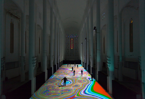
Sacré Coeur in Casablanca, Morocco was designed by French architect Paul Tournon in 1930. The cathedral's underuse (religious functions ceased in 1956) combined with its vaulting Neo-Gothic breadth, makes it the perfect venue for cultural engagement. Cue the lights: From April 3 - 6, French transmedia installation designer Miguel Chevalier bedecked the halls with Magic Carpets 2014, a projected animation that turned the institution's massive floor into a multicolored, reactive art experience. More images + video at the link... Via Lauren Moss

Google earth has partnered with a research team at the University of Maryland in the realization of an interactive, digital map that highlights global deforestation. The data used has been compiled from the results of a decade long analysis of 654,178 landsat images. each color indication on the interface corresponds to collected informational evidence: red -- forest loss from 2000-2012; blue -- forest gain from 2000-2012; magenta -- both loss and gain; green -- forest extent. Via Lauren Moss
Intro to Thinglink...
Read more with How-To: http://www.mentormob.com/learn/i/thinglink-for-teaching-learning/article-what-is-thinglink
Via Gust MEES

Gust MEES's comment,
September 3, 2012 11:21 AM
http://www.scoop.it/u/hteague
Hi Helen, Thx for sharing this! With Thinglink one can also share a whole course, I realized this here http://www.thinglink.com/scene/296377469991124993 Please check. Have a great day :) 
Dr. Helen Teague's comment,
September 6, 2012 9:05 AM
Hi Gust: Thanks for the link: http://www.thinglink.com/scene/296377469991124993
it is very informative! Have a great time today! 
Adam Schulman's curator insight,
May 17, 2014 5:44 AM
ThingLink helps you create and find images from all over the net. With those images you can then place comments and details to help your students to understand the image. You can also make your images come to life with music and video clips. you tell your stories. I have found that the use of Thinglinks are very useful in educating students with LD's because it places: images, texts, and audio methods, at the teacher's disposal. |
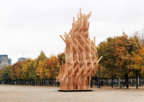
Visitors can climb to the top of this pavilion in the Jardin des Tuileries, which is made up of a complex lattice of identical timber beams. Designed by Kengo Kuma & Associates for Galerie Phillipe Gravier, the structure is based on small nomadic shelters, and has been assembled using techniques typical of traditional Japanese carpentry. "The pavilion consists of identical wooden pieces that have been stacked, twisted and assembled to create a poetic dynamic volume," said Kuma. "It offers an organic geometry by a geometric composition of wood." Via Lauren Moss
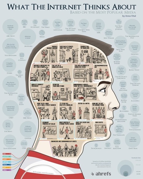
What does the Internet care about? What articles do we share the most? Using the data from the Ahrefs Content Explorer, the people at Funders and Founders Via Lauren Moss

Emilio Ruano's curator insight,
May 4, 2015 1:17 PM
At least, the concern about equality, energy and social welfare is there. I like the last one about engineers tho. Hahaha. 
Mackenzie Hamilton's curator insight,
October 13, 2015 8:36 AM
I think this article is awesome because they use data visualization to show what people share the most, visit the most, and search the most. Data is everywhere and people are using it everyday and sometimes don't even think about it.

Suspended from the ceiling of the entrance hall of the Herzog & De Meuron designed Basel Exhibition Centre, the forms that make up Jamie Zigelbaum’s Triangular Series resemble evolved stalactites. Pulsing with light and responding with a unique sensitivity to the people sharing the space with them, 59 large, suspended tetrahedra of varying sizes will be scattered throughout the space to create an all-encompassing, immersive environment for visitors as they arrive and depart the fair. Constructed from translucent acrylic, a synthesis of custom electronics, including high-power LEDs, advanced sensors and software that allow forms to communicate with individuals in the space, and each other. Each has a luminous respiratory system, and as visitors approach each object, their respiration changes and the forms react. The tetrahedrals also communicate with each other, synchronizing rhythms of illumination through a digitally mediated dialogue. While each form is itself an individual, synthetic organism, together they act as one — an emergent presence that transcends each’s individuality... Via Lauren Moss

Last spring the MUTEK Festival and the Society for Arts and Technology [SAT] released DROMOS, an immersive experience based on the science of speed. Although the festival's central mandate is to promote the best of electronic music, it also runs the parallel mission of showing off the best in innovative audiovisual material. Fresh off the success of their first collaborative work and the glowing response from viewers and the media, Mathieu Le Sourd a.k.a Maotik, and Eric Raynaud, a.k.a Fraction, are back this Wednesday with a whole new interactive, living installation.
Via Lauren Moss
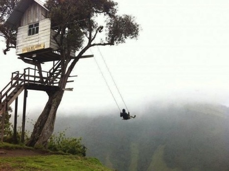
For extreme-fun seekers, who think swings will never make the list, the 'Swing at the End of the World' might just make you change your mind. Via Lauren Moss
|


