Design, Science and Technology
45.7K views | +0 today
Design, Science and Technology
#ideas #design #science #technology #inspiration #media #information
Your new post is loading...
Rescooped by Antonios Bouris from Web Dev, Web Design and Digital Marketing
Scoop.it!

Is Your Company’s Data Actually Valuable in the AI Era?

Is Your Company’s Data Actually Valuable in the AI Era? | Design, Science and Technology | Scoop.it

"AI is coming. That is what we heard throughout 2017 and will likely continue to hear throughout this year. For established businesses that are not Google or Facebook, a natural question to ask is: What have we got that is going to allow us to survive this transition?"


Via Jay
No comment yet.
Rescooped by Antonios Bouris from green infographics
Scoop.it!

An Eye-Opening Map of the Future of Global Development

An Eye-Opening Map of the Future of Global Development | Design, Science and Technology | Scoop.it

By 2050, the world’s population is projected to approach nine billion. With more people will come more developed land—a lot more.

Urbanization, agriculture, energy, and mining put 20 percent of the world’s remaining forests, grasslands, and other natural ecosystems at risk of conversion by 2050.

With that kind of expansion, there are sure to be harms—namely clean water, clean air, and biodiversity. 

To mitigate some of those risks, scientists and geographers at the Nature Conservancy have taken a crucial step by mapping the potential impact that human growth will have on natural lands.

It’s the most comprehensive look to date at how major forms of development will take over fragile ecosystems, if left unchecked...


Via Lauren Moss
CTy Thiet Ke Kien Truc Neohouse's comment, October 3, 2017 10:46 PM
Bài viết rất hữu ít . Cùng tôi chia sẻ những điều hữu ít đi .
Rescooped by Antonios Bouris from visual data
Scoop.it!

City Layouts Created with OpenStreetMap Data

City Layouts Created with OpenStreetMap Data | Design, Science and Technology | Scoop.it

Topography, architecture and traffic routes give every city a unique structure.
'These conditions create the typical and individual inner structure of a city. I didn’t only want to show these structures in the conventional way from above, but also including the exact three-dimensionality of topography and buildings – a real world visualisation.
The OpenStreetMap data enabled me to visualize the satellite-based information using DEM Earth in Cinema 4D. The results are some extraordinary views of large capitals and small towns.'


Via Lauren Moss
No comment yet.
Rescooped by Antonios Bouris from New Customer - Passenger Experience
Scoop.it!

Is there a Silver Bullet In #Customer #Experience?

Is there a Silver Bullet In #Customer #Experience? | Design, Science and Technology | Scoop.it

Via Eric_Determined / Eric Silverstein
Eric_Determined / Eric Silverstein's curator insight, September 2, 2014 3:11 PM

Terence shares valuable graphics, and reminds us all that it takes the entire organization to truly deliver across the #customer end-to-end journey.

Rescooped by Antonios Bouris from visual data
Scoop.it!

Using Big Data to Ask Big Questions

Using Big Data to Ask Big Questions | Design, Science and Technology | Scoop.it

Big Questions are speculative, exploratory, and systemic. As the name implies, they are also answered at scale: Rather than distilling a small slice of a dataset into a concrete answer, Big Questions look at entire datasets and reveal small questions you wouldn’t have thought to ask...


Via Lauren Moss
Ignasi Alcalde's comment, December 25, 2013 5:23 AM
awesome
Rescooped by Antonios Bouris from visual data
Scoop.it!

Datascaping And Designing With Information

Datascaping And Designing With Information | Design, Science and Technology | Scoop.it

DataAppeal software provides an alternative to complex mapping tools through an easy to use, web-based GIS application that renders typical data files into beautifully designed multi-dimensional maps and datascapes instantly. For architects, landscape architects, urban planners and designers of the built form, the application is a great tool to utilize evidence-based information to expose new site patterns, to provide alternative 3D modes of mapping for communication purposes, and to aid in the initiation of master plan designs.

It’s also a refreshing way to visually engage professional and students with their site-based data...


Via Lauren Moss
burlysand's comment, September 24, 2013 3:28 AM
Pretty simple..
Rescooped by Antonios Bouris from visual data
Scoop.it!

Bytes Sized: Information Storage, Visualized [infographic]

Bytes Sized: Information Storage, Visualized [infographic] | Design, Science and Technology | Scoop.it

We are living in the information age. The amount of information stored, transfered, and processed is growing at a staggering rate.


From the common megabyte to the mind-boggling yottabyte, this infographic serves as a guide to understanding the world of bytes!


Via Lauren Moss
No comment yet.
Rescooped by Antonios Bouris from visual data
Scoop.it!

Infographic: Mining Pinterest To Discover Our Color Preferences, By Room

Infographic: Mining Pinterest To Discover Our Color Preferences, By Room | Design, Science and Technology | Scoop.it

Colour and Space is a project by designers Mie Frey Damgaard and Peter Ørntoft for decorative paint brand Jotun. It digs through Turkish Pinterest boards, analyzing two fairly basic but powerful categories: color and location. The results are placed into simple pie charts, showing preferred colors in places around the home like kids’ rooms (the faintest pink), living rooms (maize), and kitchens (white).


Colour and Space leverages big data to boil all that design into the simplest of actionable metrics--what color should my living room be? Because what you’re responding to in some random interior design photo may be the unique furnishings, but it’s just as often the color--that striking palette that’s all of a trip to Lowe’s away from reality.


Via Lauren Moss
No comment yet.
Rescooped by Antonios Bouris from New Customer - Passenger Experience
Scoop.it!

15 examples of artificial intelligence in marketing

15 examples of artificial intelligence in marketing | Design, Science and Technology | Scoop.it
Artificial intelligence (see the Wikipedia definition), specifically machine learning, is an increasingly integral part of many industries, including marketing.

Via Eric_Determined / Eric Silverstein
Eric_Determined / Eric Silverstein's curator insight, April 19, 2016 3:06 PM

Is there anything AI can't do?


Ben @Econsultancy shares 15 key examples of AI in Marketing:


1. Recommendations/content curation

2. Search engines3. Preventing fraud and data breaches4. Social semantics5. Website design6. Product pricing7. Predictive customer service8. Ad targeting9. Speech recognition10. Language recognition11. Customer Segmentation12. Sales forecasting13. Image recognition 14. Content generation15. Bots, PAs and messengers 
Rescooped by Antonios Bouris from visual data
Scoop.it!

Data Visualization 101: Scatter Plots

Data Visualization 101: Scatter Plots | Design, Science and Technology | Scoop.it

In our Data Visualization 101 series, we cover each chart type to help you sharpen your data visualization skills.Scatter plots have been called the “most versatile, polymorphic, and generally useful invention in the history of statistical graphics” (Journal of the History of the Behavioral Sciences, 2005).

That’s a big claim, but just as their name implies, they can take a confusing and scattered set of data and make sense of it. As such, these plots are much more than a visualization tool; they are a discovery tool. Let’s look at what makes the scatter plot so good...


Via Lauren Moss
Marco Favero's curator insight, June 19, 2015 3:49 AM

aggiungi la tua intuizione ...

Christopher Higgins's curator insight, July 18, 2015 6:17 AM

A quick history of graphing information and how scatter plots are unique from other ways of graphing in more than one way.  A great visual of the different types of relationships that are easily identified on a scatter plot, highlighting why scatter plots are so useful to understand relationships between two different variables.  

Rescooped by Antonios Bouris from green infographics
Scoop.it!

An Interactive Flood Tool to Calculate Climate Change Risks

An Interactive Flood Tool to Calculate Climate Change Risks | Design, Science and Technology | Scoop.it
A new interactive tool estimates the economic, urban, and demographic risks through 2030.

According to the World Resources Institute, river floods affect 21 million people in the world every year. In 2030, that number could rise to 54 million, with climate change driving the increase and urbanization putting more people in harm's way...


Via Lauren Moss
Judit Urquijo's curator insight, March 29, 2015 12:33 PM

Información útil

Descarga: web

Precio: gratuita

Idioma: inglés

Website del desarrollador: World Resources Institute


Descripción

El Aqueduct Global Flood Analyzer es una herramienta web interactiva diseñada para mostrar mediante modelos los daños de las inundaciones sobre los entornos urbanos, el PIB y la población, pudiendo consultar esta información tanto desde el punto de vista de la nación, la cuenca hidrográfica o el estado.


Una vez seleccionado el ámbito, la aplicación permite seleccionar el nivel de protección contra inundaciones medido en años, que hace referencia a los tipos de sistemas construidos para prevenir las inundaciones y que normalmente suelen estar dimensionados en función de los períodos de retorno.


En base a los citados criterios, la herramienta presenta los costes generados por las inundaciones en base a datos de 2010. La aplicación también permite a los usuarios estimar el riesgo futuro, realizando proyecciones en el contexto de tres escenarios climático y socioeconómicos distintos.  


Más información

http://www.citylab.com/weather/2015/03/calculating-the-cost-of-river-floods-in-an-age-of-climate-change/387154/

http://floods.wri.org/#/

http://www.wri.org/resources/maps/aqueduct-global-flood-analyzer

Rescooped by Antonios Bouris from green infographics
Scoop.it!

9 Charts That Tell You Where Life Is Pretty Terrific

9 Charts That Tell You Where Life Is Pretty Terrific | Design, Science and Technology | Scoop.it

The Paris-based think tank known as the OECD is just out with its semi-annual survey of how different economies stack up in terms of social well-being. (Well-being is basically the polite way economists talk about happiness.) The organization even has a new data visualization to let you see where your country ranks in certain key measures.

Called "Society at a Glance," the report is well worth a read. But here are some of the most interesting bits of data we found, in no particular order.


Via Lauren Moss
Ma. Caridad Benitez's curator insight, March 20, 2014 11:47 AM

Un análisis de datos a la VENA!

Rescooped by Antonios Bouris from visual data
Scoop.it!

Subtleties of Color: Connecting Color to Meaning

Subtleties of Color: Connecting Color to Meaning | Design, Science and Technology | Scoop.it

'About a year ago, we published a blog post framed as a letter to NASA, asking them to stop using rainbow color scales. The post was written out of a general frustration with rainbow color scales, but especially out of seeing field experts and leaders, like NASA, using a perceptually incorrect color scale. We weren’t alone.


Robert Simmon from NASA’s Earth Observatory has been crusading for the same changes. He’s made great progress, and as a continuation of that, he’s responding to our “letter” with a brilliant series of blog posts on proper use of colors and color scales.'


Via Lauren Moss
No comment yet.
Rescooped by Antonios Bouris from visualizing social media
Scoop.it!

[Infographic] Facebook Ad Performance by Industry

[Infographic] Facebook Ad Performance by Industry | Design, Science and Technology | Scoop.it

Ever wonder if your Facebook ads are performing better or worse than the industry standard for ROI – searching for some Facebook benchmarking data? What is the average CPM, CTR, CPC, the average cost per like, or average page like rate for your industry or business?


This graphic is based on data from Social.com’s study of 1 million ad units and over 114 billion impressions from January 1st to March 31st, 2013. The report analyzed the top 25 countries globally and top five countries per region based on impressions. All rates were converted to U.S. dollars using the average daily conversion rates during the reporting period.


You can use this data in many different ways – one of which is determining ROI of your Facebook Campaign to determine if social media is worth the ROI for your business.


Via Lauren Moss
Free Viral Ads's curator insight, July 13, 2013 1:05 AM

Facebook Ad Performance By Industry


Ana Quillinan's curator insight, July 13, 2013 8:47 AM

How your ads rank on Facebook could have countless other reasons why it performs better or worse, ie - timing, image quality, messaging, target market, etc. Test on a relative basis with multiple ads. 

Lee Tonitto's curator insight, July 19, 2013 9:51 AM

Here is a great source of metrics for your next social media campaign

Rescooped by Antonios Bouris from visual data
Scoop.it!

The World as 100 People / Infographic

The World as 100 People / Infographic | Design, Science and Technology | Scoop.it

A demographic portrait of humanity if the world were 100 people.


From data source, 100people.org:

The world population has now reached 7 billion people. This milestone inspired us to conduct research to update our statistics, and the changes over the past 5 years are remarkable. In 2006, only 1 person out of 100 would have had a college education-- today that number has jumped to 7 thanks in part to advances in higher education in Asia. The detailed research and source information can be found here and the statistics provided by Donella Meadows in 1990 that originally inspired our project can be viewed here.
Via Lauren Moss
Aurélia-Claire Jaeger's curator insight, March 29, 2013 6:03 AM

J'aime bien ce coup d'oeil sur notre monde ...

Rescooped by Antonios Bouris from Curation, Social Business and Beyond
Scoop.it!

Curating Information & Making Sense of Data Is a Key Skill for the Future [Research]

Curating Information & Making Sense of Data Is a Key Skill for the Future [Research] | Design, Science and Technology | Scoop.it

Robin Good: The Institute for the Future and the University of Phoenix have teamed up to produce, this past spring, an interesting report entitled Future Work Skills 2020.


By looking at the set of emerging skills that this research identifies as vital for future workers, I can't avoid but recognize the very skillset needed by any professional curator or newsmaster.


It should only come as a limited surprise to realize that in an information economy, the most valuable skills are those that can harness that primary resource, "information", in new, and immediately useful ways.


And being the nature of information like water, which can adapt and flow depending on context, the task of the curator is one of seeing beyond the water,

to the unique rare fish swimming through it.


The curator's key talent being the one of recognizing that depending on who you are fishing for, the kind of fish you and other curators could see within the same water pool, may be very different. 


Here the skills that information-fishermen of the future will need the most:
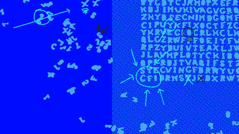
 

1) Sense-making:

ability to determine the deeper meaning or significance of what is being expressed


2) Social intelligence:

ability to connect to others in a deep and direct way, to sense and stimulate reactions and desired interactions


3) Novel and adaptive thinking:

proficiency at thinking and coming up with solutions and responses beyond that which is rote or rule-based


4) Cross-cultural competency:

ability to operate in different cultural settings


5) Computational thinking:

ability to translate vast amounts of data into abstract concepts and to understand data-based reasoning


6) New media literacy:

ability to critically assess and develop content that uses new media forms, and to leverage these media for persuasive communication


7) Transdisciplinarity:

literacy in and ability to understand concepts across multiple disciplines


8) Design mindset:

ability to represent and develop tasks and work processes for desired outcomes


9) Cognitive load management:

ability to discriminate and filter information for importance, and to understand how to maximize cognitive functioning using a variety of tools and techniques


10) Virtual collaboration:

ability to work productively, drive engagement, and demonstrate presence as a member of a virtual team


Critical to understand the future ahead. 9/10


Curated by Robin Good


Executive Summary of the Report: https://docs.google.com/viewer?url=http%3A%2F%2Fapolloresearchinstitute.com%2Fsites%2Fdefault%2Ffiles%2Ffuture-work-skills-executive-summary.pdf 


Download a PDF copy of Future Work Skills 2020: https://docs.google.com/viewer?url=http%3A%2F%2Fapolloresearchinstitute.com%2Fsites%2Fdefault%2Ffiles%2Ffuture-skills-2020-research-report.pdf  


Via Robin Good, janlgordon
janlgordon's comment, December 19, 2011 1:14 PM
Hi Robin,
Great information!
Beth Kanter's comment, December 20, 2011 7:34 PM
Thanks for sharing this from Robin's stream. These skills sets could form the basis of a self-assessment for would-be curators, although they're more conceptual - than practical/tactical. Thanks for sharing and must go rescoop it with a credit you and Robin of course
janlgordon's comment, December 20, 2011 7:56 PM
Beth Kanter
Agreed. It's also one of the articles I told you about....good info to build on:-)