Ecom Revolution
24.9K views | +0 today
Follow
Hacking Happens - 5 Security Measures shares the death, taxes & websites get hacked as life's new certainties or maybe not if you do these 5 steps today.
Scoop.it!
No comment yet.

Website Migration Trauma shares 5 tips to take befoe you move your site, 5 tips sure to reduce trauma and protect your hard web marketing work. 


  • Up Your PPC Spend.
  • Tighten Your Site Maps & create SILO based maps (advanced).
  • 301 never 302 and Watch Webmaster Tools like a hawk for 404 Page Not Found.
  • Create highly social & shareable content like contests and games.
  • Know your 80:20 Rule and creating supporting content BEFORE the migration.
Scoop.it!
No comment yet.

Web Migration Trauma
Website migration creates seo, traffic and money trauma. We share 5 website migration tips so your next web heart / lung transplant helps you gain not lose:

  • Up Your PPC Spend.
  • Tighten Your Site Maps & create SILO based maps (advanced).
  • 301 never 302 and Watch Webmaster Tools like a hawk for 494 Page Not Found.
  • Create highly social & shareable content like contests and games.
  • Know your 80:20 Rule and creating supporting content BEFORE the migration.

 
Included ADVANCED tips too in case you are a high risk player OR more advanced in your SEO knowledge. 


Scoop.it!
malek's curator insight, May 28, 2015 10:16 AM

Ok, for now I'd rather have a web site migration than a root canal.

Martin (Marty) Smith's comment, May 28, 2015 2:02 PM
Let's see ROOT CANAL or website migration? ROOT CANAL by a large margin for me. At least a bad root canal isn't going to cost me my JOB unless so painful I go nuts in which case I have other problems LOL. Thanks @malek. Marty
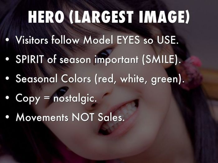
This holiday selling season (2014) will happen as close to real time as any thanks to the social / mobile web. Listening and curating are going to be important, but so is tapping the nostalgia and spirit of the season in creative and collaborative ways.

Martin (Marty) Smith:

Not to late to make these changes to your ecommerce website before the holidays. Rock On and have a great holiday selling season.

Scoop.it!
No comment yet.

I'm not sure what to blame such a poor showing on basic holiday ecommerce design on, but this year's November crop is flat, uninspiring and junky.

L. L. Bean usually sets the holiday standard. This year their November offering is marred by an obnoxious animated image that includes their great Free Shipping Offer. I HATE putting such a great free shipping offer on a roll because it is easy to miss in the 5 to 9 seconds most visitors give a webpage before moving on (granted this is BEAN so maybe 15 seconds). 

Bean has the tough job of competing with themselves and, in past holiday selling seasons, they define how to create great holiday look and feel. Holiday look and feel can be tough. I like Patagonia's approach - put up snow scenes AND a surfer on a massive wave (hey its Christmas in Hawaii too). 

The other faux pas that is unforgivable after all these years is Free Shipping obfuscation. Many leading retailers are going free shipping all orders and some are going the Zappos route and offering free returns too. Of the 37 websites reviewed only 6 earned A ratings on three criteria:

* Free Shipping.
* Holiday Look and Feel. 
* Holiday merchandising via categories such as For Him, Her, Kids. 

The other big miss is websites who think they are too cool for the holidays (AE.com, Restoration Hardware). Black on black at the holidays is expensively too cool and self absorbed. 

If you know smaller websites who know how to do the holidays right please share in comments or email Martin.Smith(at)Atlanticbt.com. 


Scoop.it!
Randy Ksar's curator insight, November 13, 2013 7:40 PM

interesting topic on #ecommerce UX design. any other websites that you know are doing innovative desktop or mobile ecommerce design work?

From backpacking to cycling to staying in shape and more, outfit your outdoor activities with the latest gear, clothing & footwear at REI.
Martin (Marty) Smith:

5 Must Steals From REI
Here re five easy steals from http://www.rei.com that will increase your Holiday sales:

* Red DEAL or SALE button Far Right.

* Deal of the Day (you can put this anywhere).

* Loyalty Program (there are canned ones you can install).

* Trigger Point Free Shipping (below Login).

* BIG Search Box Next to logo.


Red Deals Button
REI.com is aware that the right side of a website can be a gutter. If you use the F design idea, and they do, and watch eyetracking you know you can manipulate a visitors eyes with things like a long horizontal menu bar. Since everyone clicks on DEALS REI.com puts it far right and in a somber red (to match their black menu bar).

Deal of the Day
REI.com's is above their footer in the middle (another potential gutter). DEAL shoppers will find that link no matter where you put it, so put it in a potential gutter and you convert "dead space" to ROI positive with a simple graphic and idea. At this time of year and with social media being so HUGE if you don't have a great Deal of the Day lined up you will suffer at the hands of the REI.com's.

Loyalty Program
I hesitated to put this in since installing a loyalty program can feel like invading Russia in the winter. Don't let it get that way. Buy a canned and simple loyalty program or create some easy way to reward your most loyal shoppers. If you can't get your website loyalty together by the holidays use your "Multi-Buyer" segment and serendipitous give them something no one else gets (via an email). Find your 80/20 rule (20% of your customers will do 80% of your sales) and REWARD the 20%.

Free Shipping Trigger
When I was a Director of Ecommerce my boss was so skeptical and worried about Free Shipping I had to do extensive analysis and tests. Here is what we found:

* Free Shipping Triggers are always exceeded by 40% or more.
* Free Shipping beats no Free Shipping every time.
* Make sure your Shipping Schedule is PRESENT and easy to understand.

REI.com's $50 Free Shipping probably produces an Average Order Value (AOV) of just under $100 (or more). Remove the objection (shipping costs are seen as a "don't buy" objection) and your buyers will buy. Interestingly all orders, all shipments FREE SHIPPING didn't always win. Seems Free Shipping is related to BUYER PSYCHOLOGY so some friction actually helps, some hurdle may help buyers feel special.

Big Search Box
My theory is REI.com's menu system is so complex they have to have great internal search. Even if your navigation is perfect expect half of your customers to want it their way (by using search). If you want to get really cool make sure you are merchandising your search sets with either faceted search or dynamic zones (zones you fill with content based on behavior or modeled analytics).


Scoop.it!
No comment yet.
Gamer Joseph Kim Rocks E-commerce These are the times we live in. Times when one of the most substantial, intelligent and interesting e-commerce and cont
Martin (Marty) Smith:

I built on Joseph Kim's amazing 12 Critical Mobile Monetization Concepts to beat a familiar drum - the sooner e-commerce merchants think like video game developers the more money they will make. 

Soon there will be a dividing line between ecom websites that understand how the semantic web. Expect a growing demand for relevance and trust (in visitor intelligence and web savvy) to change website design.

Kim's article, the first of a promised three parter, is an amazing find since it makes the point of how similar video game development and ecommerce is and will become. Once Google UNDERSTANDS our content the more "game-like" it is the more visitors will become buyers.

I've often been asked how teams I've mananged made over $30M online with AOVs (Average Order Values) never higher than $62. The secret is to be five minutes ahead. Kim's post and thinking like a video game developer as you merdhandise your e-commerce website will help your team be five minutes ahead.

Oh, and this next wave, the semantic web wave, is going to be a monster, so surf if you dare :). M 

Scoop.it!
No comment yet.
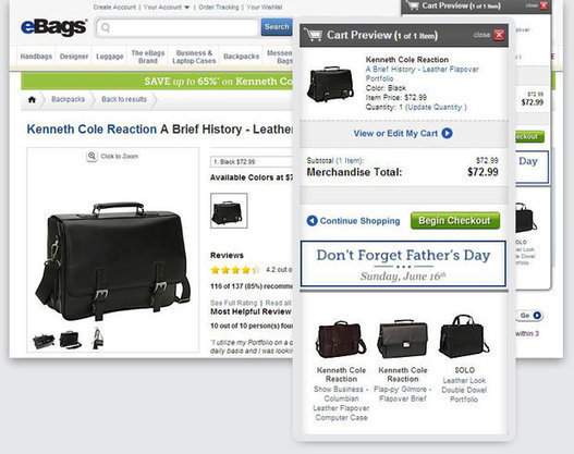
Here are a few fundamental guidelines that can get you started in improving or designing a perfect checkout e-commerce funnel.
Martin (Marty) Smith:

Work Backwards
Most website designers work IN to the checkout. This means they are spending most of their time on pages that are important but less important than the checkout. 

Check is where ecommerce rubber meets road. If you create sense of security and ease people remember and return. If your cart is complicated, clicky-y and a pain they don't. I typically pick these "how to" posts apart because they over simplify and so kill the real issue of commerce online. 

This post is solid, shares great tips and knows what it is talking about (no nits from me, stop the presses LOL). If you are creating an ecommerce store, and everyone should have one, follow these tips to create a solid checkout experience. 

Not a bad idea to work backwards. Create the cart first and let that design set the clear and simple tone for the rest of the site. 

Read my 5 New Ecommerce Lessons for why everyone should have an ecommerce store:

http://scenttrail.blogspot.com/2013/06/5-new-ecommerce-lessons.html 

Scoop.it!
No comment yet.
When it comes to eCommerce design, every decision matters because aspect of your design impacts conversion...even the colors. Offline merchants have been using color tactics for centuries to lure c...
Scoop.it!
No comment yet.
Here's our third lesson on Facebook EdgeRank!  Don't forget to catch up on lessons one and two and subscribe to our blog for future lessons :)
Martin (Marty) Smith:

Optimizing images for Facebook edgerank. 

Scoop.it!
No comment yet.

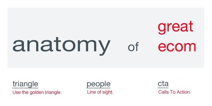
Great E-Commerce Homepage Design Tips

Three concepts are critical to great e-commerce website design:
* Golden Triangle
* People Sight Lines.

* Calls To Action.

Tis post shares specific examples of each of these Critical Success Factors (CSFs) for great conversion and engagement in ecommerce website design.

Scoop.it!
RDV Weekly's curator insight, March 7, 2014 4:55 PM

Pure design-based conversion factors. A quick dive into the psychological mind of your customer, and how to play to that knowledge.

Martin (Marty) Smith:

Great checklist for B2B or B2C website homepage design.

Scoop.it!
AlGonzalezinfo's curator insight, February 11, 2013 2:35 PM

this works better for business sites than academic sites, but it is a very good resource.

Sección de Metodologías de la Universidad de Murcia's curator insight, February 12, 2013 3:19 AM

Interesante guía rápida que propone 12 elementos que debería tener la página principal de un sitio web

35 Beautiful Ecommerce Websites 'Related' LinksShowcase Of Well Design Ecommerce Websites30 Beautiful Non-Profit Organization Websites45 Beautiful Typography Websites30 Inspiring Music Websites For Design InspirationA Showcase of Outstanding Websites...
Martin (Marty) Smith:

My favorite from these is BikeByMe.com. Very Cool. There are other designs that will convert better, but none are more fun. 

Scoop.it!
No comment yet.
A couple of tips for a clean online store design with some inspirational examples of minimal e-commerce sites.
Martin (Marty) Smith:

I'm in favor of ANYTHING that helps customers move toward a conversion point faster. This is my favorite line from this post about clean ecommerce store designs: 

More and more companies are ditching lots of color, models and movement on their websites in favor of more minimal design schemes.

I attribute this "simple is better" trend to the strength of A/B testing. The more testing you do the more simple your pat to conversion becomes (it is inevitable). Good Ecom design tips here for 2013.  

Scoop.it!
No comment yet.

Scoop it Creator

Martin (Marty) Smith

FOLLOW US