
We've done a bunch of good things on the CureCancerStarter.org design, but, as with any new thing, there are areas that need improvement too, As an old ecommerce Director I like "money maps"
Money Maps
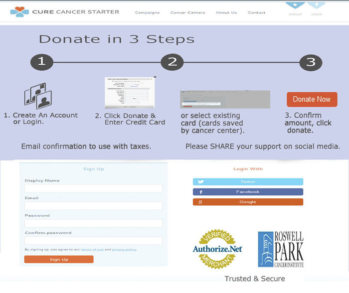
Money maps are when you detail how many steps it takes to checkout. Even if your cart is advanced enough to stay within one page Money Maps are still a very good idea. The more clear you can be graphically about where a visitor is in the process the more conversions your ecommerce (or in this case a 501c3 nonprofit seeking donations) will receive.
Trust Marks
No one ever clicks on a Trust Mark, but their absence is suspicious so I like to include them but rarely use the widget supplied by the company (because the widget can slow the page down and no one clicks on it anyway). Take a picture of the trust mark and print the words Trusted and Secure under your marks.
Trusted and Secure identifies why the marks are there and there is research that shows merely saying a power word like "trusted" helps create trust. In our case the bridge is Authorize.net, the CC processor varies so instead of getting into all of that I suggest we opt for the cancer center logo.
By using the cancer center logo next to the Authorize.net logo the context is clear and the trust extends both ways (from Auth.net to the cancer center and back again).
I will hand my rough over to our designers and UX people, but creating a money map and including trust marks wrap a NEW idea such as CureCnacerStarter.org in comfortable recognizable process. Comfort is GOOD when creating the trust needed to help visitors become buyers or donors.