Ecom Revolution
24.9K views | +0 today
Follow

A blog about ecommerce marketing, running an online business and updates to Shopify's ecommerce community.

Marty Note
We agree with all 7 of these "product page best practices" such as:

1. Powerful product descriptions (tell a short story and use language from reviews). 

2. Clear Call-To-Action (CTAs).

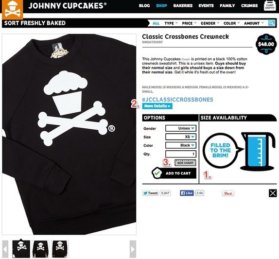
3. Size Chart (we love the Johnny Cupcakes graphic).

3. Include Stock Levels (and use Amazon's only 4 left language).

4. Great Product shots.

5. Social Share buttons (with feedback loops for # of shares, look at SumoMe.com for the best social share widget).

6. Shipping & Free Shipping info clear and easy to find.

7. Relevant to what is happening now (Holiday theme).

8. Remove background (this one was new to us, but we get it).

& The forgot 2 of our favorites:

9. Reviews - voice of the customer is the most convincing and begins to create online community.

10. TEST - we've only beaten a red "Add To Cart" button once, but we only knew we beat it because we tested.

Scoop.it!
No comment yet.

7 Tips On Curating HERO Images and Why This Porsche Picture ROCKS

Martin (Marty) Smith

North Carolina Museum Of Art and Art of Internet Marketing
Kudos to whoever is managing the digital marketing team at the North Carolina Museum of Art (NCMA). I got a nice tweeted thank you for my Wall Street, Texans and a Thief story about the Porsche By Design exhibit (http://sco.lt/6mfIMD ).

I visited Porsche By Design yesterday as I attempt to wander my way through the CrowdFunde business plan, but that is another story. NCMA's web team included a Win A Porsche raffle (so a viral contest) and some of the most amazing pictures of cars I've ever seen. KUDOS!

The didn't include the picture above, but I wanted to take a moment and share Internet marketing image tips learned during my 7 year Director of Ecommerce tenure. The picture above makes a great HERO (largest images on webpage are called 'heroes") because:

* High contrast (white car with red car in immediate background). 
* Action since the photographer is focusing and people are milling.
* People milling create interest. Note how none of the "milling people" are looking AT the camera so they don't distract since we would follow their eye sight lines if they were looking at the camera). 
* The milling crowd moves out and then back into the white car because of the way the RED CAR is pointed (brilliant again). 
* The car becomes a huge POINTER, so putting a CTA (Call-To-Action) under it would get lots of clicks. 
* The photographer becomes a pointer too since many would click anything immediately below him.  

* Gaze follows the photographer’s camera and the sight lines of people in the picture (note the guy LOOKING at the photographer who is focusing on the car = BRILLIANT).  

This photograph is GEINUS since it creates excitement, provides amazing pointers that would direct visitor eyes to Calls-To-Action and its basic color, high contrast would work well within any web design. 

My question is are you thinking about your hero images this deeply? If not you are NUTS since serendipity is not a scalable Internet marketing strategy (lol). Quick tips for Heroes:

* Remember to look for pointers that will direct your visitors’ gaze. 
* We look at PEOPLE more than things. 
* We also look WHERE people are looking. 
* We really LOOK at babies, but same rules apply (we look where they look). 
* The direct gaze at the camera is welcoming and creates engagement.

* Two people talking heads turned away is a disaster (excludes visitors). 
* Don't over use the direct gaze idea. 
* Crowds can work, as they do here, but be aware that visitors will follow their sight lines too. 
* When people's sight lines aren't available we look for and find other directional clues. 

This last bullet is the real RUB of using images on your website. THINK about how any image moves visitors to the next step. Images (and video) can help or hurt your website's goals. Follow these simple tips and images will HELP move visitors to subscribers, contributors, advocates and buyers.  


Read more
Scoop.it!
Martin (Marty) Smith's comment, December 18, 2013 3:26 PM
Thanks for ReScoop and kind words on my first Infographic John. You rock! Thought of you when I was looking at these cars. Have a great holidays. Marty

Great E-Commerce Homepage Design Tips

Three concepts are critical to great e-commerce website design:
* Golden Triangle
* People Sight Lines.

* Calls To Action.

Tis post shares specific examples of each of these Critical Success Factors (CSFs) for great conversion and engagement in ecommerce website design.

Scoop.it!
RDV Weekly's curator insight, March 7, 2014 4:55 PM

Pure design-based conversion factors. A quick dive into the psychological mind of your customer, and how to play to that knowledge.

Scoop it Creator

Martin (Marty) Smith

FOLLOW US