Robin Good: This has got to be a dream come true.
Create professionally-looking interactive graph charts (and soon also full infographics) with the best tool and easiest interface available out there.
Infogr.am makes it as easy as it can possibly be the creation of charts that will always look great and effective no matter what your design skill level is.
You simply choose the type of graph you want (bar, line, pie, matrix) to create, edit the existing data with your own, and you are ready to go.
Each chart is designed following some basic information design principles, allowing data to be easily read and for the chart to look very credible and "professional".
Also: each chart created with Infogram can be easily embedded on any web site, and customized in size and colors used.
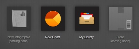
Infogram integrates an online library where to save your completed work, and an upcoming online store.
Try it out now: http://infogr.am/app/ ;
Awesome. 10/10
Via
Robin Good,
Jenny Pesina


 Your new post is loading...

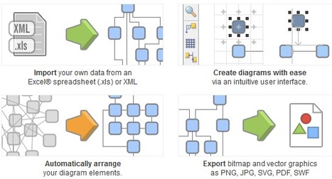


yED software is free to download, it works on all platforms and helps you create beautiful diagrams using ready-to-use elements. Import your data, including from Excel, and export your diagrams in a wide range of graphics formats.
Engaging and super fun!
Pour les professeurs ou les élèves qui souhaitent agrémenter leurs documents de graphiques soignés