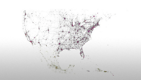
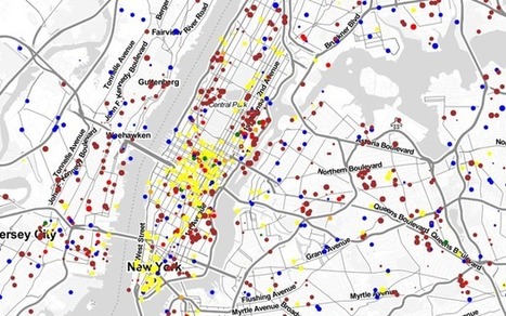
Mankind loves making maps, and the world wide web, densely interconnected and phenomenally complex, always makes for a nice visual.
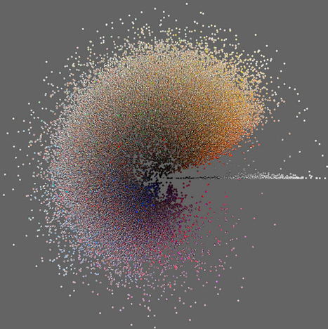
Typically these take the form of neon blobs floating against black backgrounds, like frames captured from old Winamp plug-ins, and while they’re always nice to look at, they don’t always do much in the way of helping us understand the massive global network we traverse every day. This latest effort, however, is a little different. Called simply Map of the Internet, it’s as informative as it is beautiful.
The map, which takes the form of a free app for Android and iOS, features 22,961 of the Internet’s biggest nodes--not individual websites, but the ISPs, universities, and other places that host them--joined by some 50,000 discrete connections. The app gives you two ways of surveying it all: geographically, on a globe, or by size, which rearranges the nodes into a loose column of points. Both views are interactive; instead of showing the Internet as a static neon blob, the app lets you explore the neon blob in the round, with all the familiar multitouch gestures. It may not look like the Google Maps app, but it instantly feels like it, which makes exploring the underbelly of the web all the easier...
Via
Lauren Moss


 Your new post is loading...


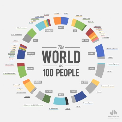


global interconnections!!
I was absolutely delighted to see this film on the big screen...it was as visually stunning as any film I'd ever seen. I and my young children were mesmerized. So much of the modern world that we take for granted is absolutely revolutionary. This is a great teacher's guide to teaching with this film.
Tags: transportation, globalization, diffusion, industry, economic, National Geographic, video, visualization.