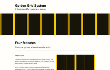

Responsive design is all about adjusting designs to accommodate screens of different sizes. If you want to create a responsive web design you should use fluid grids, images and queries.
Get Started for FREE
Sign up with Facebook Sign up with X
I don't have a Facebook or a X account

| Tags |
|---|
 Your new post is loading... Your new post is loading...
 Scoop.it!
Responsive design is all about adjusting designs to accommodate screens of different sizes. If you want to create a responsive web design you should use fluid grids, images and queries. No comment yet.
Sign up to comment
Scoop.it!
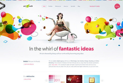
It is our web design showcase that aims to not only showcase the best and most innovative web design styles currently available, it also aims to give you a visual overview of current web design trends and highlight the latest in ...
Scoop.it!

RT @ILikeDesign: “@smashingmag: In case you missed it: Wireframing for responsive design - http://t.co/LMu15NUL”...
Scoop.it!
The rest of the media world is beginning to see the light about UX.As part of the media world, book publishers need what UX wisdom and practice can offer.
Scoop.it!
![Apple's Amazing Profits [INFOGRAPHIC] | Must Design | Scoop.it](https://img.scoop.it/IkcmVB_98YgVGdKlRxdW7jl72eJkfbmt4t8yenImKBVvK0kTmF0xjctABnaLJIm9)
It's no secret Apple, the most valuable public company in the world, is making major cash off today's must-have tech gadgets — but how much? **** Apple's cash in the bank is bigger than all but 52 companies. Their profits crush Walmart desipite have sales only a quarter as large. Not what you MAKE but what you TAKE that counts and Apple is using design to win hearts and minds and prove how profitable such a strategy can be in a flat, furioius and connected world. Marty
Scoop.it!

Every day there is a new technology or innovation that comes up. As a web designer, your job is to keep up with the latest innovations and learn them accordingly. Good tips and love the "lead" position granted designers in this post since design is leading so much of our new industrial revolution. |
Scoop.it!

Circles in web design – 40 amazing examples http://t.co/XDbzMrdA...
Scoop.it!

Indeed, there are frameworks and plugins that will make it much easier for you to create responsive designs. Continue reading and check out useful tools for creating responsive web design as well as 35 stunning examples of responsive web ...
Scoop.it!
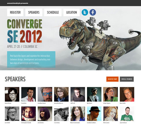
As I try to do ever month, I am bringing you the latest in website design inspiration. There is never a shortage of new and great websites to get your (Great Website Design: 40 Truly Inspiring Creations -
Scoop.it!
An overview of why infographics are important, touching on their history, application and creation. Via XPLAIN
Scoop.it!

Rules are made to be broken, and the world of web design is no exception. Love these breakable rules. Marty |