Marty Note
I love beautiful websites. They seduce, charm, hypnotize and rarely convert worth a hoot. Conversion is about clear signals and obvious paths (read Krug Don't Make Me Think). I agree mystery plays a role, but every website element must pass the five second rule.
If you can't understand what to do in five seconds neither can your customers and you have infinitely more patience than any customer. Conventions such as large heroes and four columns of products stacked up one on another exist because they work. A "hero" is the largest image on a webpage.
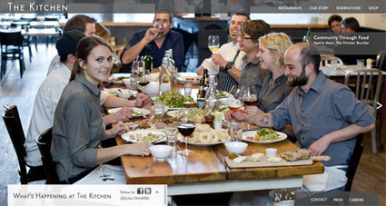
These examples make for beautiful films, but they sacrifice conversion for beauty. Some websites can afford to sacrifice cash for beauty most want both. Beauty is important. My first website, was created in 1999 (you can see it here: http://scenttrail.blogspot.com/2010/02/martins-first-web-site.html ).
That site created all those years ago could look rougher and more "garage band" than any website I would create today or than the large ecommerce site my team and I managed for seven years when I was a Director of Ecommerce. We had numbers we had to beat every day or seek employment elsewhere :).
Design and beauty influence trust and trust influences conversion. These 20 examples create a boatload of trust, but frustrate a visitor's desire to invest that trust in action. Don't do that is the best advice I can give you (lol). Don't do that UNLESS your site is art and not commerce.


 Your new post is loading...


