


 Your new post is loading...


Visual Juxtapositions Captures Attention
Attention not cash is the most valuable "commodity" in the world. We can make more cash. We can't make more TIME. Attention is under attack.
Most curate, read, create and share a variety of content online in a variety of ways daily. As you head closer to the key "branding demographic" of 18 to 34 the amount of CONTENT these "brand preferences not yet set" consumers process daily is staggering.
If your visuals aren't stunning you aren't in the game. You may need more than "stunning". You may need strong visual juxtaposition to stop a swipe long enough to have your message read, shared or bought.
Here are 3 tips for creating winning visual juxtapositions:
* Align your juxtaposition to a key brand message.
* More dramatic visual juxtapositions create greater stopping power, but you may notice engagement drop off (so keep Calls To Action simple and use high contrast).
* Visual juxtapositions MUST pay off in copy and experience.
This last tip is critical since a visual juxtaposition that has amazing stopping power and then is skimpy on relevance (either to the juxtaposition OR the reader) feels like "bait and switch" and can make those who stopped angry (don't typically want this).
Imagine a horizontal line with "Low visual juxtaposition" on the left and "High Juxtaposition" on the right. As your visual juxtaposition heads toward a red line the demands on your content go up almost square the amount of juxtaposition.
That's confusing so let's say it more simply. The more dramatic your juxtaposition the better your content must be. Don't think this means you must explain the juxtaposition immediately. Never explain your juxtapositions right off.
The longer your push your explanation the more "attention tension" you create. Curious minds are looking for an explanation to your visual juxtaposition, an explanation you MUST give. I like to write copy AROUND the juxtaposition.
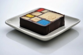
Copy Example for the Mondrian Dessert (pictured above)
1911, Paris
A new arrival didn't mind the cold windy August. He changed his name dropping an "a" to make the new name roll of French tongues easier. He wasn't mad for air races like everyone else. Things he cared for where rectangular and earthbound.
Earthbound would be a debate with the Spaniard, but acceptable to the less volatile French painters (George particularly). Grey Tree sat on his easel. Broadway Boogie Woogie was a war and thirty years away.
Can chocolate be "neoplastic"?
Piet Mondrian created the art movement De Stijl based on a simple grid. We create desserts based on a simple grid too. Our Mondrian Grid tastes like a 1911 Paris bistro.
Imagine sitting with friends spending an afternoon drinking coffee, arguing and sharing one more Mondrian Grid. Wishing this day would never end a robotic trill says a friendly goodbye to Paris, 1911.
You decide to take a chocolate Mondrian Grid home and notice the box shares a story about an unusually windy August day in Paris long ago when the city was mad for air races and a handful of artists created a revolution in taste, culture and time.
***
The greater the sense of time, place and mood copy builds the longer you can afford to delay the juxtaposition payoff. The Mondrian cake is a mild juxtaposition so my copy example can afford to go around the bend a little (the wandering first two paragraphs).
Those wandering fist two paragraphs are more functional than they seem. I imagined the copy for a shop like Serendipity in NYC, a destination you go to as a "guilty pleasure" to escape the press of LIFE.
Copy can communicate messages such as "guilty pleasures" and "escape" by wandering around a little. Note even in the wandering the factual base is correct if romantic (hey its Paris).
PS
Added a discussion about copy tone, rhythm and speed on GPlus
https://plus.google.com/102639884404823294558/posts/dDpmMM9mEaL


