Curation Revolution
55.1K views | +1 today
Curation Revolution
Curation the next web revolution.
Your new post is loading...
Scooped by Martin (Marty) Smith
Scoop.it!

Ultimate Guide To Creating A Great News Page via @mkramer

64 Ways To Think About a News Homepage - TheLi.st @ Medium - Medium

This has to be the most comprehensive, well thought out post we've ever seen on creating a news page. They focus on "news homepage", but the lessons apply well to a page every website needs - News. 

News is becoming increasingly important. We are drowning in information, but your ability to filter, curate and share what is really important builds following, increases traffic and shares. News pages need to be constructed in particular ways to as the post points out.

Build in some Feedly, Twitter widgets or Buzz Sumo (or other ways to make the page ping automatically. Don't go 100% feeds since that opts out of the principal benefit - showing your ability to filter, curate and influence by what you choose.

Best curator at exposing his filter preferences and building substantial following I know is Brian Yanish at Marketing Hits (@Marketinghits). 

Create a great news page, have some of it fire with a robot and curate the rest and your following, traffic and return will grow.  

No comment yet.
Scooped by Martin (Marty) Smith
Scoop.it!

Turn Visitors Into Your Customers With Persuasive Web Design

Turn Visitors Into Your Customers With Persuasive Web Design | Curation Revolution | Scoop.it

Persuasive Web Design

Clarity – the Basic RequirementVisual FirstSet the Visual in Proper HierarchyAdd a Call to ActionKeep User Behaviors in Mind

Martin (Marty) Smith's insight:

add your insight...

No comment yet.
Suggested by Iulian Grigorescu
Scoop.it!

eCommerce Websites Convert Better With Modern Web Design Techniques

eCommerce Websites Convert Better With Modern Web Design Techniques | Curation Revolution | Scoop.it

You probably heard about the modern web design term at least once, but how can be used correctly with an online shop? What are the requirements?

Marty Note (here is how I shake out on each of these recs)

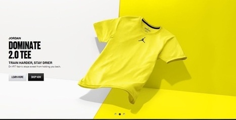
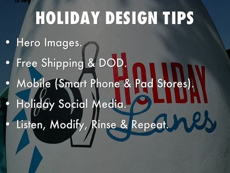
Big Hero Or Sliders Agree With Caveat!
Depends on what you do immediately to the right or under your large hero. Hero's create HOT SPOTS on the right and immediately below, hot spots that convert and hot spots NO ONE uses (goofystupid). If you are running an ecommerce site you aren't selling the picture, but you do need the attention it can grab. Make sure you put a Call-To-Action to the right or immediately below. People don't like to click within a hero (especially a big one), so CTA below even if it is a restatement.

http://www.charitywater.org/
Does a good job with a large static hero and a "can't miss" CTA with 3 critical links almost directly below the hero. & I DO NOT like sliders.

Warmer Colors - AGREE!
Websites are inherently COLD so warming them up with strong accent colors is a must. Remember to figure in the images you like to include. You can use more warm color if your images always have white backgrounds. If not, you may achieve "warmer" with images instead of needing to modify your design.

Interesting Grids - AGREE!
Thanks to Pinterest the GRID is getting creative. Grids are a great way to share a lot of information fast.

Flat Design - Agree!
The web doesn't do 3D well (yet), so flattening out your design can help make buying decisions easier. Include zooms if applicable and remember to ask your customers to share pics of your products on them or in their homes (great User Generated Content).


Animation
Vine has me convinced there are ways to create animations that help and don't hurt, but be careful. An animation that doesn't stop (like Vine videos) can be obnoxious. I prefer giving control of animations to the click over auto-play. If someone ASKED to see the animation its different than if you just start playing it and it doesn't stop.


Mobile Friendly UI - Agree!
Your responsive design must master the swipe, spin and scroll of the mobile experience. If your site isn't FUN and easy to spin, snip and buy from your customers won't. Spoke with a friend at lunch in the craft space today and her traffic is now HALF mobile, so make sure your content is FUN to use on a phone or pad and takes advantage of the mobile UI.

No comment yet.
Scooped by Martin (Marty) Smith
Scoop.it!

Holidays Are Hot: 5 Holiday Website Design Tips via @HaikuDeck

Holidays Are Hot: 5 Holiday Website Design Tips via @HaikuDeck | Curation Revolution | Scoop.it
This holiday selling season (2014) will happen as close to real time as any thanks to the social / mobile web. Listening and curating are going to be important, but so is tapping the nostalgia and spirit of the season in creative and collaborative ways.
No comment yet.
Scooped by Martin (Marty) Smith
Scoop.it!

Making Process Visible & A Lesson In Web Design: Mario Botta at Bechtler Museum

Making Process Visible & A Lesson In Web Design: Mario Botta at Bechtler Museum | Curation Revolution | Scoop.it

Curator As Hero
I won't copy my linked GPlus (https://plus.google.com/102639884404823294558/posts/3KLUrc157bC ) post except to say look at the ceiling. I left the top of this image so you can see THE LIGHTS.

I like to do this exercise in department stores too. Looking at the lights gives you a sense for how some a hard working team created the subtle emphasis that now guides your learning and eye. Seeing the lighting always tells you how DRAMATIC the act of curating is too.

NOW ask yourself how you create drama, emphasis, light and shadow on your website? I share more #webdesign thoughts on the linked post. Bravo to the team at the Bechtler Museum in Charlotte, NC for their hard work on the Mario Botta exhibit. KUDOS!

No comment yet.