Bonnes Pratiques Web & Cloud
58.8K views | +4 today
Follow
Bonnes Pratiques Web & Cloud
Administration cloud et développement web
Curated by Mickael Ruau
Your new post is loading...

Popular Tags

Current selected tag: 'RESS - responsive Web design plus server-side comp'. Clear
Scooped by Mickael Ruau
Scoop.it!

Server-Side Rendering Explained - DZone Web Dev

Server-Side Rendering Explained - DZone Web Dev | Bonnes Pratiques Web & Cloud | Scoop.it
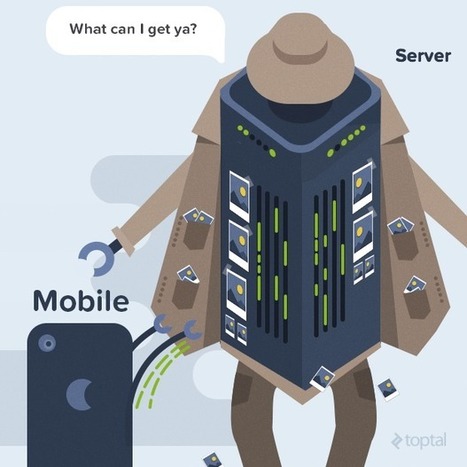
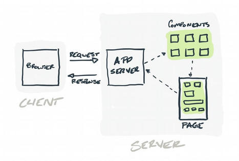
In this article, we discuss what it means to use SSR. Server-side rendering (SSR) is a method of loading your website’s JavaScript on your own server.
Mickael Ruau's insight:

We’ve already discussed some of the SEO benefits of server-side rendering: flawlessly crawled and indexed JavaScript pages, no more wasted crawl budgets or plummeting search rankings, no sluggish two-wave indexing process; just smooth, seamless indexation and the steady stream of Google traffic that comes with it.

SSR has even more advantages than the ones above. 

It optimizes web pages for social media, not just search engines. When someone shares your page on Facebook or Twitter, the post includes a preview of the page.

It comes with a number of performance benefits that improve your website’s UX. SSR pages have a much faster load time and a much faster first contentful paint because the content is available in the browser sooner. That means less time your user has to look at a loading screen. 

JavaScript is resource-heavy and code-intensive. Downloading it onto a browser using CSR contributes significantly to page weight. A single JavaScript file averages out to about 1MB, whereas web development best practice advises keeping the entire page under 5MB max. 

The performance enhancements that come with SSR also have their own SEO benefits.  

Google gives preferential search rankings to the sites with the fastest page load speed. Faster load times improve user metrics such as session duration and bounce rate; Google algorithms look at these metrics and give you an extra SEO boost.

Faster web pages. Happy search engines. Happy user.

No comment yet.
Scooped by Mickael Ruau
Scoop.it!

Approche côté serveur du responsive – 24 jours de web

Approche côté serveur du responsive – 24 jours de web | Bonnes Pratiques Web & Cloud | Scoop.it
24 jours de web : Le calendrier de l'avent des gens qui font le web d'après.
No comment yet.
Scooped by Mickael Ruau
Scoop.it!

Client-Side and Server-Side Techniques for Responsive Design

Client-Side and Server-Side Techniques for Responsive Design | Bonnes Pratiques Web & Cloud | Scoop.it
No comment yet.
Scooped by Mickael Ruau
Scoop.it!

Guide des solutions d'images adaptatives en Responsive Web Design

Guide des solutions d'images adaptatives en Responsive Web Design | Bonnes Pratiques Web & Cloud | Scoop.it
Un guide des solutions d'images adaptatives en Responsive Web Design
No comment yet.
Scooped by Mickael Ruau
Scoop.it!

Improving Responsive Web Design With RESS

Improving Responsive Web Design With RESS | Bonnes Pratiques Web & Cloud | Scoop.it
The basis of Responsive Design is the screen size but it's crude indicator of the device's capabilities. Could RESS be a better solution?
Mickael Ruau's insight:

he concept uses Responsive Web Design but supplements it with feature detection to serve modified content when required. For example, you could:

  • Serve smaller images on smaller screens or when bandwidth is limited.
  • Only serve a video element when the device has HTML5 support on a fast connection.
  • Avoid serving Flash games or adverts on iOS and increasingly Android devices.
  • Switch to grayscale images on eBook readers.
  • Reduce the frequency of Ajax poll requests on slower connections.
  • Remove unnecessary CSS3 effects when the device does not support animations.
  • Fall-back to PNG images when SVG is not available.
  • Provide additional information when the user is in a specific location or country.

RESS never became a widely-used technique because feature detection is difficult — especially on the server. Your detection code must be verified, updated and maintained every time a new browser or feature is released. Fortunately, there are third-party services such as Netbiscuits which do the hard work for you and are constantly updated with the latest device information.

No comment yet.
Scooped by Mickael Ruau
Scoop.it!

LukeW | Breaking Development: The Server Side of Responsive Web Design

In his presentation at Breaking Development in Nashville TN, Dave Olsen talked through how RESS can provide the benefits of both responsive Web design and server-side optimization. Here's my notes from his talk on The Server Side of Responsive Web Design.


Mickael Ruau's insight:
Server-side techniques include user agent detection, server-side breakpoints, and robust server-side feature detection.Server-side breakpoints: set a file path based on window.innerWidth, then use that variable on the server to render appropriate components and even layouts of pages.Modernizer-style feature detection can be used on the server to create a list of feature variables. These can then be used to render the appropriate mark-up/CSS on the server before sending pages to a client.Server-side feature detection can be used together with client-side detection.You can fetch different content based on breakpoints in the client. The An Event Apart site uses Javascript to fetch mark-up from the server based on screen size in the client.RESS isn't a silver bullet anymore than Responsive Web Design is. Server-side feature detection can be spoofed, but that tends not to happen often. Data needs to be separated strongly from your layout -this has CMS implications but is generally a good thing.Properly set cache headers: make sure CDNs don't cache the wring assets.Are client-hints the future of RESS? The browser can give a server data that it can act on like window width, bandwidth, and potentially more. This looks like a way to bring more reliable server-side optimization techniques to Web developers in the future.
No comment yet.
Scooped by Mickael Ruau
Scoop.it!

Components: Server-Side vs. Client-Side

Components: Server-Side vs. Client-Side | Bonnes Pratiques Web & Cloud | Scoop.it
Building a website in 2021? I’m guessing you’re going to take a component-driven approach. It’s all the chatter these days.React and Vue are everywhere...
No comment yet.
Scooped by Mickael Ruau
Scoop.it!

RESS – Responsive Webdesign and Server Side Components

Use a mixture of user agent detection and browser feature detection or a device detection library to enhance your responsive website.
No comment yet.
Scooped by Mickael Ruau
Scoop.it!

Best Online Responsive Website Testing tool- Supports localhost Testing

Best Online Responsive Website Testing tool- Supports localhost Testing | Bonnes Pratiques Web & Cloud | Scoop.it

Responsive Website Testing tool How your site's design will look on most common devices resolutions multiple devices: desktop, tablets, smart phones, television

No comment yet.
Scooped by Mickael Ruau
Scoop.it!

Images responsive et attribut sizes, amstramgram, pic... - Alsacreations

Images responsive et attribut sizes, amstramgram, pic... - Alsacreations | Bonnes Pratiques Web & Cloud | Scoop.it
No comment yet.
Scooped by Mickael Ruau
Scoop.it!

Responsive Images with WURFL Image Tailor

Responsive Images with WURFL Image Tailor | Bonnes Pratiques Web & Cloud | Scoop.it
If you’re concerned about the size of the download and the impact on low-end devices, you have two possible options: 1) Maintain multiple copies of the image and 2) use a server-side routing algorithm to detect devices and intelligently serve the most appropriate copy of the image. A framework like Bootstrap won’t be helpful in this scenario. You can write your own server-side infrastructure (i.e., an HTTP handler) or you can use something like WURFL Image Tailor (WIT).

WIT is a free server-side tool that acts as a proxy between the WURFL web site and the source of the image. Instead of requesting the image directly from the origin server, you pass the origin URL to the WIT service. WIT will get the image from the original server, resize it to match the capabilities of the detected device and serve back to the user agent just the bits it reckoned appropriate. In other words, the image is resized on-the-fly based on the type of requesting device and the resized image is cached for further use. If you have no other concerns about the image except the size of the download, here’s all you need:

1

As mentioned, WIT is a free service with a limit of 20,000 images per month per website. Past that limit, your pages will still work unchanged and WIT will simply act as a redirector.
No comment yet.
Rescooped by Mickael Ruau from Responsive WebDesign
Scoop.it!

Why a one-Web approach works better than mobile Web

We are living in a multi-screen world where consumers devour digital content on multiple devices, at multiple locations, and in different usage modes. Having an engaging, all-around Web experience across mobile, tablet, desktop and beyond is fast becoming a digital imperative for today’s marketers. But how do we as marketers best achieve a true cross-platform Web presence for our customers?


Via gonzodesign
Mickael Ruau's insight:

There is no arguing whether a one Web experience is critical for a company’s online success today. But the path to get there can be long and arduous, fraught with difficult decisions and complex development challenges.


Choosing the right tools for the job can make or break a marketer’s budget, yet has the potential to turn a mediocre Web site into an exceptional cross-platform customer experience.


For this reason, Web technology should be focused on creating server-side solutions to simplify multi-device development.

Marrying server-side technology with responsive design techniques allows the server to do all the heavy lifting, while providing the visitor with a clean, high-performing Web experience.

gonzodesign's curator insight, October 20, 2013 8:01 PM

Marrying server-side technology with responsive design techniques allows the server to do all the heavy lifting, while providing the visitor with a clean, high-performing Web experience.