Big Data + Libraries
4.6K views | +0 today
Big Data + Libraries
Big data and its collation and use in the library and information world and education.
Your new post is loading...
Scooped by Elizabeth E Charles
Scoop.it!

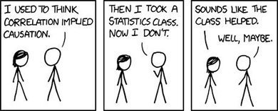
How to Lie with Visualizations: Statistics, Causation vs Correlation, and Intuition!

How to Lie with Visualizations: Statistics, Causation vs Correlation, and Intuition! | Big Data + Libraries | Scoop.it
Post adapted from Correlation vs Causation: Visualization, Statistics, and Intuition!

As someone who has a tendency to think in numbers, I love when success…
No comment yet.
Scooped by Elizabeth E Charles
Scoop.it!

How to Build Dashboards that Persuade, Inform, and Engage | Tableau Software

How to Build Dashboards that Persuade, Inform, and Engage | Tableau Software | Big Data + Libraries | Scoop.it

Do your dashboards tell the story you want to get across or does your data get lost in a sea of pixels? Tableau strives to keep our users in the flow with software centered on principles of design, cognition, and perception. The same principles apply to great dashboards.

No comment yet.
Scooped by Elizabeth E Charles
Scoop.it!

14 Fantastic Examples of Complex Data Visualized

14 Fantastic Examples of Complex Data Visualized | Big Data + Libraries | Scoop.it
By 2015, the global annual rate of data production is expected to reach 5.6 zettabytes, double the rate of growth in 2012, according to IDC.
That’s a lot of in…
No comment yet.
Scooped by Elizabeth E Charles
Scoop.it!

From MOOCs to Learning Analytics: Scratching the surface of the 'visual' | elearn Magazine

From MOOCs to Learning Analytics: Scratching the surface of the 'visual' | elearn Magazine | Big Data + Libraries | Scoop.it
The visualization of big MOOC data enables us to see trends in student behaviors and activities around the globe, but what is it that we are not seeing?
No comment yet.
Scooped by Elizabeth E Charles
Scoop.it!

Meaningful metrics and visualisation for libraries - a workshop overview from Pi and Mash | artefacto

Meaningful metrics and visualisation for libraries - a workshop overview from Pi and Mash | artefacto | Big Data + Libraries | Scoop.it

Our recent workshop at the Pi and Mash unconference, held at Senate House Library in August, came about because we wanted to start a discussion about how we might make the most of user and collection data to help deliver library services. How can we ensure that we’re making data-driven decisions about services and not just reflecting a narrow view of what a library should do?

No comment yet.
Scooped by Elizabeth E Charles
Scoop.it!

4 Powerful Tools For Making Your Own Interactive Content - Edudemic

4 Powerful Tools For Making Your Own Interactive Content - Edudemic | Big Data + Libraries | Scoop.it
Infographics are popular. They’re a fun way to present and read data, and many people believe that information that is presented visually is often retained better (at least for some learners). Many teachers today are using infographics, both in their classrooms and for their own professional development. There are so many tools out there to …
No comment yet.
Scooped by Elizabeth E Charles
Scoop.it!

How We've Been Visualising Big Data Over the Centuries

How We've Been Visualising Big Data Over the Centuries | Big Data + Libraries | Scoop.it
Data visualisation is by no means a new thing, as evidenced by a new science exhibition at the British Library.
No comment yet.
Scooped by Elizabeth E Charles
Scoop.it!

Using WordPress for research data collection and visualization

Using WordPress for research data collection and visualization | Big Data + Libraries | Scoop.it
At the beginning of my contribution to the OU’s OER Research Hub project it was interesting to see a post by Martha Burtis (University of Mary Washington) on WordPress as a Data Collection Tool. Th...
No comment yet.
Scooped by Elizabeth E Charles
Scoop.it!

Learning From Mistakes in Visualization

Learning From Mistakes in Visualization | Big Data + Libraries | Scoop.it
Doing data visualizations correctly takes careful consideration. Incorrectly visualizing something can be misleading, embarassing, and even damaging to
No comment yet.
Scooped by Elizabeth E Charles
Scoop.it!

Visualization: The Simple Way to Simplify Big Data | Innovation Insights | Wired.com

Visualization: The Simple Way to Simplify Big Data | Innovation Insights | Wired.com | Big Data + Libraries | Scoop.it
Data visualization has an amazing ability to make the complex simple, and the latest tools can do much more than give everyone the same view of data. It?s
No comment yet.
Scooped by Elizabeth E Charles
Scoop.it!

VIDEO: Data visualisation part I - Edward Tufte

VIDEO: Data visualisation part I - Edward Tufte | Big Data + Libraries | Scoop.it
Causal inference is not only about statistics, but also about understanding data. And with increasing computer power, we sure can analyse bigger dataset (big data), but the data is harder to unders...
No comment yet.
Scooped by Elizabeth E Charles
Scoop.it!

How to use a graph database to solve Big Data problems

How to use a graph database to solve Big Data problems | Big Data + Libraries | Scoop.it
First of all, for the uninitiated, what is a graph database? A graph database is a persistence layer, data access layer, and query mechanism based on the graph data structure.
No comment yet.
Rescooped by Elizabeth E Charles from Information and digital literacy in education via the digital path
Scoop.it!

70 Tools And 4 Reasons To Make Your Own Infographics - Edudemic

70 Tools And 4 Reasons To Make Your Own Infographics - Edudemic | Big Data + Libraries | Scoop.it
Let's talk about ways you can make your own infographics - but first - let's discuss WHY you'd want to make some infographics for teachers and students!
No comment yet.
Scooped by Elizabeth E Charles
Scoop.it!

Observatory that transforms big data into images launches at Imperial - Imperial College London

Observatory that transforms big data into images launches at Imperial - Imperial College London | Big Data + Libraries | Scoop.it
Imperial College London Observatory that transforms big data into images launches at Imperial Imperial College London An observatory that allows people to visualise everything from cryptocurrency transactions to migration patterns, will open at...
No comment yet.
Scooped by Elizabeth E Charles
Scoop.it!

Four great visualizations - AnalyticBridge

Four great visualizations - AnalyticBridge | Big Data + Libraries | Scoop.it
We actually have three posts to share with you today:

Data science: It's greater than the sum of the parts
Four great visualizations
64 new external resource…
No comment yet.
Scooped by Elizabeth E Charles
Scoop.it!

Learning to See Data

Learning to See Data | Big Data + Libraries | Scoop.it
Developing instinctual learning can help scientists see patterns in the digital universe.
No comment yet.
Scooped by Elizabeth E Charles
Scoop.it!

The beauty of data visualization | David McCandless (YouTube)


http://www.ted.com David McCandless turns complex data sets (like worldwide military spending, media buzz, Facebook status updates) into beautiful, simple diagrams that tease out unseen patterns and connections. Good design, he suggests, is the best way to navigate information glut -- and it may just change the way we see the world.

No comment yet.
Scooped by Elizabeth E Charles
Scoop.it!

Data Analytics and Visualisation

Data Analytics and Visualisation | Big Data + Libraries | Scoop.it

Data visualisation examples data-analytics.github.io Selected Tools is a collection of tools that worls for the people on a daily basis and recommend warmly.


Visualization is the graphical presentation of information, with the goal of providing the viewer with a qualitative understanding of the information contents. which would result in to retrive hidden insights of the data D3.js is a JavaScript library for manipulating documents based on data.

No comment yet.
Scooped by Elizabeth E Charles
Scoop.it!

Visualising helps make sense of data - Teresa Tocewicz |Research Information

Visualising helps make sense of data - Teresa Tocewicz |Research Information | Big Data + Libraries | Scoop.it

Big data, big problem? When it comes to data, we’re getting more and more of it – but our ability to understand that information is far more important. At Jisc we’ve run a competition inviting people to visualise library data, as Google and the Guardian have done with open government data, and the British Library and others are now doing the same for the key data from the seven UK research councils. 

No comment yet.
Scooped by Elizabeth E Charles
Scoop.it!

What Does Big Data Look Like? Visualization Is Key for Humans | Innovation Insights | Wired.com

What Does Big Data Look Like? Visualization Is Key for Humans | Innovation Insights | Wired.com | Big Data + Libraries | Scoop.it
Image: infocux Technologies/Flickr

A simple Google image search on “big data” reveals numerous instances of three dimensional one’s and zero’s, a few explanatory infographics, and even the interface from The Matrix. So what does “big data” look like, within human comprehension?

Ask a CEO of a major company what “big data” is, and they’ll likely describe something akin to a blackbox, the flight recorders on airplanes, or draw a cloud on a whiteboard.

No comment yet.
Scooped by Elizabeth E Charles
Scoop.it!

10 ways to use infographics

10 ways to use infographics | Big Data + Libraries | Scoop.it
Big data is one of the largest idea trends of 2013, and the biggest question surrounding it has been figuring out the best way to interpret it all.

Whether you are a corporation ...
No comment yet.
Scooped by Elizabeth E Charles
Scoop.it!

7 Data Viz Sites to Inspire Your Creative Eye

7 Data Viz Sites to Inspire Your Creative Eye | Big Data + Libraries | Scoop.it
These sites help you find useful ways of interpreting big data, including infographics and other data visualizations.
No comment yet.
Scooped by Elizabeth E Charles
Scoop.it!

10 Reasons Information Visualisation Rocks - Conspire: A @Mindjet Publication

10 Reasons Information Visualisation Rocks - Conspire: A @Mindjet Publication | Big Data + Libraries | Scoop.it
Humans are naturally visual creatures -- here are 10 great reasons to hop on the information visualisation train.
No comment yet.
Scooped by Elizabeth E Charles
Scoop.it!

Edward Tufte - FT.com

Edward Tufte - FT.com | Big Data + Libraries | Scoop.it
Edward Tufte is the guru of graphics, the high priest of presentation.


High quality global journalism requires investment. Please share this article with others using the link below, do not cut & paste the article. See our Ts&Cs and Copyright Policy for more detail. Email ftsales.support@ft.com to buy additional rights. http://www.ft.com/cms/s/2/dda1cb5c-f4c0-11e2-a62e-00144feabdc0.html#ixzz2adzoOLk3

Edward Tufte is the guru of graphics, the high priest of presentation. For more than 30 years he has been showing us how to visualise data with simplicity, clarity and elegance, while campaigning against “chartjunk” and other design practices that lead to obfuscation.

No comment yet.
Scooped by Elizabeth E Charles
Scoop.it!

About: HTML5 based PivotViewer for Visualizing LInked Data

#LinkedData #URI for "HTML5 based PivotViewer 1.0 Overview" on @slideshare : http://t.co/kCU1eIwGbP . #LinkedData #SPARQL #NewSQL #BigData
No comment yet.