Your new post is loading...
Les données sont aujourd’hui un enjeu essentiel. En art, elles sont à la fois point de départ et matériau d'oeuvres contemporaines ainsi que de nouvelles methodologies de recherche. Nous proposons d’aborder cette question par un dialogue entre un artiste et un chercheur. Fabien Zocco, artiste diplômé du Fresnoy en 2016, présentera sa démarche basée sur les données, et en particulier ses créations à partir de twitter et google street view. Clarisse Bardiot reviendra sur le programme Culture Analytics qu’elle a suivi en 2016 à la UCLA (avec entre autres Lev Manovich) et les enjeux de ce nouveau champ disciplinaire pour la recherche sur l’art. ...
Burak Arikan is a New York and Istanbul based artist working with complex networks. He takes the obvious social, economical, and political issues as input and runs through an abstract machinery, which generates network maps and algorithmic interfaces, results in performances, and procreates predictions to render inherent power relationships visible and discussable. Arikan’s software, prints, installations, and performances have been featured in numerous exhibitions internationally. Arikan is the founder of Graph Commons collaborative network mapping platform. Arikan has presented his work internationally at institutions including Museum of Modern Art New York, Venice Architecture Biennale, São Paulo Biennial, Istanbul Biennial, Berlin Biennial, Sharjah Biennial, Marrakech Biennial, Ashkal Alwan, Ars Electronica, Sonar, DEMF, Neuberger Museum of Art, KW Institute for Contemporary Art, Kunstmuseum Bochum, Asia Art Archive, Borusan Contemporary, DEPO, ARTER, SALT and at independent venues such as Art Interactive Cambridge, Künstlerhaus Bethanien, Hafriyat, Turbulence (online). He has lectured and did workshops at institutions including Massachusetts Institute of Technology, Rhode Island School of Design, New York University Interactive Telecommunications Program, The New School, Istanbul Technical University, Bogazici Universtiy, Sabanci University, and Istanbul Bilgi University. Arikan completed his master’s degree at the MIT Media Laboratory in the Physical Language Workshop (PLW) led by John Maeda. Prior to MIT, he received an MA degree in Visual Communication Design from Istanbul Bilgi University in 2004, and a BS degree in Civil Engineering from Yildiz Technical University in 2001.
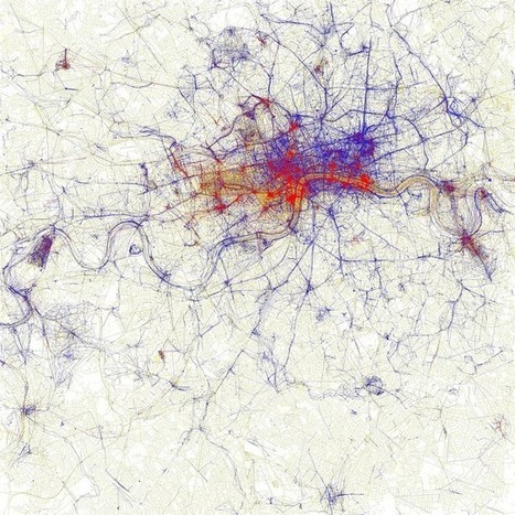
Eric Fischer is data artist and software developer at Mapbox. He was an artist in residence at the Exploratorium in San Francisco, and software engineer on the Android team at Google.
What’s big data? until not long ago, we looked at the abundance uf urban data as an enormous lists of numbers unconnected, difficult to manage or as an academic or research papers. But our way of seeing and understanding big data has changed, while we discover how some people, artists, researchers “geeks” use this urban data in order to create new ways of undesrtanding the society. ... The pionner on mapping big data will attend to Technarte 2015 to talk about his work in Big Data and Art. ...
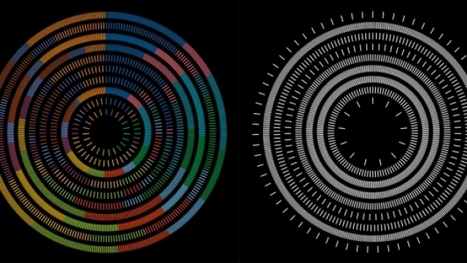
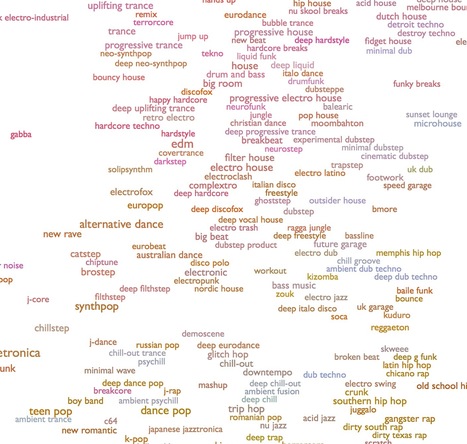
This is an ongoing attempt at an algorithmically-generated, readability-adjusted scatter-plot of the musical genre-space, based on data tracked and analyzed for 1374 genres by The Echo Nest. The calibration is fuzzy, but in general down is more organic, up is more mechanical and electric; left is denser and more atmospheric, right is spikier and bouncier.
The development of digital technologies has brought fundamental changes into our lives, cultures and societies. Social networking media user generated sites and peer-to peer networks have contributed to the development of a new participative culture where users have access to tools to create and share contents with peers. As web users, we spend significant time online, searching for contents and visiting numerous web pages. These actions leave traces that can be collected, typically within web server logs. These data represent potential sources of valuable information for various private and public purposes.
Commercial companies have well understood how useful the above mentioned data can be if properly analyzed and transformed into exploitable information for their targeted audiences. Meaningful analysis, representation and comparison of actions, habits and navigation history of web users can help them to better understand and exploit the knowledge that these data contain.
However, in most cases, users cannot access the generated information that is kept private although the original data have been created by the users themselves...
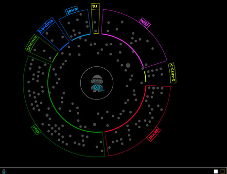
Si Wikipedia peut être un cosmos à lui tout seul de par les millions d’articles et connaissances qui y sont stockés. Owen Cornec, jeune étudiant français, a eu l’idée géniale de créer un nouvel astre lumineux de l’encyclopédie en ligne pour en faire un immense réseau interactif d’articles nommé WikiGalaxy. Se retrouver dans un réseau d’étoiles fait de milliers d’informations n’est pas simple et les liens deviennent des chemins intersidéraux – presque performatif – menant d’une découverte à une autre. ....
http://wiki.polyfra.me
We specialise in web applications, 2D & 3D visualisations, mapping and the digital arts. Our work covers a wide range of fields including education, museum exhibits, architecture and design. Many of our projects are research based, enabling us to experiment with emerging technologies and their creative potential.
Googlehouse est un dispositif online réalisé en 2003 par Marika Dermineur (Incident.net) et Stéphane Degoutin. Son thème est l'invention de l'espace domestique sur internet. Les moteurs de recherches et les moteurs d'images constituent les points de passage d'internet, sélectionnent et donnent accès aux milliers d'archives personnelles. La googlehouse met en perspective ces images.
The Social Collider reveals cross-connections between conversations on Twitter. It acts as a metaphorical instrument which can be used to make visible how memes get created and how they propagate. Ideally, it might catch the Zeitgeist at work.
Karsten Schmidt - concept, design & programming (@toxi) Sascha Pohflepp - concept, design (@plugimi)
More info: csismn.com/SYN-Phon Graphical notation and composition by Candas Sisman
Barabás Lőrinc: Trumpet
Ölveti Mátyás: Cello
Candas Sisman: Electronics and Objects Budapest Art Factory (BAF) is pleased to present to you SYN-Phon; sound performance based on graphical notation by Candaş Şişman featuring Barabás Lőrinc & Ölveti Mátyás. Candaş Şişman resided at BAF for the month of June as part of its cross-cultural fertilization residency program. SYN-Phon will be exhibited to act, as a visual linguistic delivery through a cogitation segment followed by the sound performance on June 29th. csismn.com
budapestartfactory.com
barabaslorinc.com
accordquartet.hu
Body is a sculpture which responds to the emergent properties of the environment in South London where the artist's wireless sensor network is situated. It represents the changing life and complexity of urban space as a dynamic, kinetic artwork. Real-time environmental data is embodied in Stanza's life-size sculpture assembled from computer components and acrylic slices of his own physique. In ‘Body 01000010011011110110010001111001' the urban environment provides a dynamic flickering and clicking sentience to the otherwise inert structure, reflecting the personal level of influence data has on an individual. ...
Stanza is an internationally recognised artist, who has been exhibiting worldwide since 1984. His artworks have won twenty international art prizes and art awards including:- Vidalife 6.0 First Prize. SeNef Grand Prix. Videobrasil First Prize. Stanzas art has also been rewarded with a prestigious Nesta Dreamtime Award, an Arts Humanities Creative Fellowship and a Clarks bursary award. His artworks have been exhibited with over fifty exhibitions globally. Participating venues have included :- Venice Biennale: Victoria Albert Museum: Tate Britain: Mundo Urbano Madrid: New Forest Pavilion Artsway: State Museum, Novorsibirsk. Biennale of Sydney, Museo Tamayo Arte Contemporáneo Mexico: Plymouth Arts Centre: ICA London: Sao Paulo Biennale...
When an unregistered user makes a contribution to Wikipedia, he or she is identified by his or her IP address. These IP addresses are translated to the contributor’s approximate geographic location. A study by Fabian Kaelin in 2011 noted that unregistered users make approximately 20% of the edits on English Wikipedia [edit: likely closer to 15%, according to more recent statistics], so Wikipedia’s stream of recent changes includes many other edits that are not shown on this map. You may see some users add non-productive or disruptive content to Wikipedia. A survey in 2007 indicated that unregistered users are less likely to make productive edits to the encyclopedia. Do not fear: improper edits can be removed or corrected by other users, including you!
How it works
This map listens to live feeds of Wikipedia revisions, broadcast using wikimon. We built the map using a few nice libraries and services, including d3, DataMaps, and freegeoip.net. This project was inspired by WikipediaVision’s (almost) real-time edit visualization.
The Wikipedia Recent Changes Map is open source and available on github. If you are interested in visualizing Wikipedia, check out the other data resources that are available.
Chords connect lyrics on the same line with the color scheme determined by a really complicated algorithm (1 word/line = red, 2 words/line = blue, 3 words/line = red+blue_black). The two time markers show (1) when the lyrics start and (2) when the tempo kicks up a notch. (If you're pressed for time, just forward past the 2nd marker). Made with processing.org
|
In a world filled with ever-more-complex technological, sociological, ecological, political & economic systems... a tool to make interactive simulations may not be that much help. But it can certainly try. LOOPY is also open source and public domain, meaning it's free for coders, educators, and just about anybody to re-use and re-mix LOOPY as they see fit.
I present a number of core concepts from data science that are relevant to digital art history and the use of quantitative methods to study any cultural artifacts or processes in gen-eral. These concepts are objects, features, data, feature space, and dimension reduction. These concepts enable computational exploration of both large and small visual cultural data. We can analyze relations between works on a single artist, many artists, all digitized production from a whole historical period, holdings in museum collections, collection metadata, or writings about art. The same concepts allow us to study contemporary vernacular visual media using massive social media content. (In our lab, we analyzed works by van Gogh, Mondrian, and Rothko, 6000 paintings by French Impressionists, 20,000 photographs from MoMA photo-graphy collection, one million manga pages from manga books, one million artworks of con-temporary non-professional artists, and over 13 million Instagram images from 16 global cities.) While data science techniques do not replace other art historical methods, they allow us to see familiar art historical material in new ways, and also to study contemporary digital visual culture...
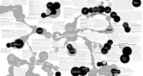
'Complex Net Art Diagram: A Remix' of MTAA is a remix of MTAA's simple net art diagram, linkoln.net have created the complex version. . It's a map, a history, and a parody of one hundred things: net art and net art's various historicisations, diagrams per se, histories per se, anything at all done in a totalising spirit, etc.
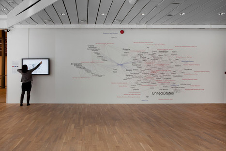
The Paris-based artists Léonore Bonaccini and Xavier Fourt form the artist-duo Bureau d´études. For the last several years, the French Group has been producing cartographies of contemporary political, social and economic systems. The visual analysis of transnational capitalism is based on extensive research and usually is presented in the form of large-sized murals.
‘Governing by Networks’, a chart produced in 2003, visualizes the mutual involvements and dependencies within the global media conglomerates. Revealing what normally remains invisible and contextualising apparently separate elements within a bigger whole, these visualizations of interests and cooperations re-symbolize the unseen and hidden.”
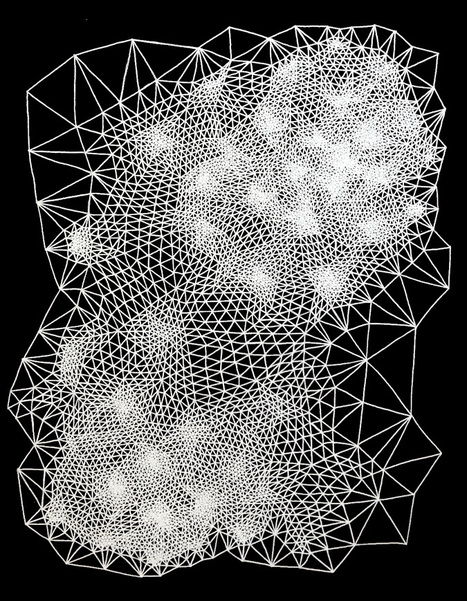
Clint Fulkerson is an artist from Maine who began his career with a degree in metal smithing. As a metalsmith he said he learned to become slow and precise which was the opposite to the painting he was doing at the time with broad gestural strokes. This became his new method of working and he now forces himself to “slow down and consider each moment in the present” which allows him to think about the influences of his work that range from science and math to information technology.With information technology, math, science and precision on his mind Fulkerson draws works that are remissent of tesselation (tiling) patterns that fit perfectly together. The drawings evolve based on rules that he has developed which define the placement of each mark. While his personal algorithms are the overriding design each work begins at a random place and then evolve as he works.
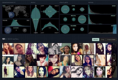
The Creators Project commissioned three artists to transform your Facebook profile into a 3D printed object. We created a language-based horoscope system called Astroverb, built upon a fictitious Mystical-Scientific framework called Morpholumenology.
The application extracts your Facebook Wall Text. It then uses linguistic algorithms to analyze how much you talk about yourself, what time of day you do it, and how much you use certain categories of language, in addition to what your friends say to you. The algorithm plots all of this data on a circular chart called the Semantic Plane.
The application generates a predictive nugget of wisdom for you and traces out a customized shape called a Morphogram. Using the Shapeways 3D printing platform, you can print out your Morphogram as a real amulet.
Larbitslab is a Brussels based research laboratory which represents artists and scientists who are working on topics of visualization of digital environments.
The main idea is to show a new way of “infographic” drawings. Because everything we see is biological, mathematical or geological information. It can also be cultural patterns or any other thing. Complexity Graphics works are based on mathematical simplicity and harmony. I would describe them as infographic abstracts. This mathematical style helps me to illustrate everything from biological cell to the space and meditative worlds. That’s why I admire by math, because it’s everywhere and nowhere.
FΔCEWORLD is a website that allows users to navigate through a 3-dimensional realm of their own personal Facebook history. *open app in Google Chrome for maximum performance.
Les données, comprises comme un ensemble de signes traduits sur un support à accès non-linéaire, sont une nouvelle catégorie de phénomènes dans notre quotidienneté. Modifiant profondément notre accès et notre conception du monde, notre façon même d’agir dessus, nous cherchons des moyens de les représenter. Nous sommes entourés de données mais elles restent la plupart du temps illisibles même si nous les manipulons et les utilisons dans l’ensemble de nos activités de travail et de loisirs. Si nous ne sommes qu’au balbutiement de ce nouveau mode de représentation, il faut en remarquer l’originalité. Qu’est-ce donc que ces images? Sont-elles abstraction ou figuration? Comment entendre la différence qui pourrait séparer la visualisation de la représentation dans son sens classique? La visualisation des données a pour objectif de rendre sensible, en un clin d’oeil, un grand stock de données et donc de transformer ces unités discrètes en une perception qui tend vers la plus grande continuité possible. Le flux turbulent des données binaires est traduit en aplats, formes, lignes et flèches afin de rendre compte, non pas de chaque unité mais des mouvements de différence entre elles. La visualisation des données est donc différentielle. À cette fin, la visualisation des données ajoute des données aux données, car elle en est elle-même constituée. ...
Point Cloud is an attempt to reimagine our daily interaction with weather data. Weather has always had a unique place in our lives, because it has a multiplicity that encompasses both the concrete and the indeterminate. It is the intangible context within which we build our lives and our cities, but it is also the physical element against which we create protective shelter. Most of the time it is an invisible network that we can see but are not aware of; yet it can manifest in a spectacle or disaster, come forward and activate our senses, make us forget our rationality in delight or fear. With modern scientific and technological developments, we can now deploy sophisticated monitoring devices to document and observe weather. Yet despite these advances, our analysis and understanding of meteorology is still largely approximate, and in many cases, inaccurate. Weather continues surprise us and elude our best attempts to predict, control, and harness the various elements. In contrast, however, the nuances of weather’s continuously shifting states are largely oversimplified as the information is transmitted into our daily experience. Our various home and mobile devices most likely distill a forecast into static representations, such as numeric values or simple infographics of sun, clouds, or rain. There is a deep discrepancy between the flatness of the visualizations we are accustomed to, and the rich mixture of tactility and perceptibility of our immediate physical experience. As a critical response to these issues, Point Cloud emerges as a sculptural form defined by a thin wire mesh, driven asynchronously by 8 individual servos controlled via Arduino. As whiteness of the hanging structure begins to disappear into the background, the viewer is treated to a constantly morphing swarm of black points dancing through midair. The project’s ambitions are two-fold - first and foremost it seeks to meditate on the transmutation of digital data back into analog movement. In the current prototype, the speed, smoothness, and direction of rotation are modulated to interpret a live feed of weather data. Instead of displaying static values of temperature, humidity, or precipitation, Point Cloud performs the data, dynamically shifting between stability and turbulence, expansion and contraction. It re-introduces weather conditions as a permanently variable state, and creates a visceral experience in our interactions with weather. The second aspiration of the project is an attempt to conceptually mime the structural complexity of meteorological systems - wherein predictable elements converge into unpredictable or unexpected outcomes. The various components of Point Cloud are functionally autonomous and clearly defined: 4 cables descend into a central control core, from which a lightweight steel space frame cantilevers and supports the 8 servos. Each servo powers a cam mechanism that activates 3 to 4 pistons that push and pull on various parts of the wire mesh - composed of over 300 feet of wire thread, and 966 intersection joints. Despite the fact that the only type of mechanical actuation is linear, the resulting motion is like that of a third degree digital surface; the effects each push and pull ripple out along the elastic tension of the wire threads, and in combination with the syncopated rhythm of the servos, create movement that is complex, unexpected, and hopefully wondrous.
The latest from HfK Bremen Infovis (@hfkb_infovis). Tweeting the infovis courses by Moritz Stefaner @moritz_stefaner at HfK Bremen (2011 and 2013). Bremen
|