Your new post is loading...
LA CHAMBRE BLANCHE est heureuse d’accueillir l’exposition «Graphiques dégénérés» se déroulant dans le cadre de VISQuébec. Le Meetup et le vernissage de l’exposition auront lieu le 1er mai à partir de 17h. L’exposition se déroulera du 1er mai au 7 mai 2017.
Pour le Meetup, nous aurons le plaisir d’accueillir un spécialiste de Silicon Valley en visualisation de données : Micah Stubbs. Ce dernier s’implique activement à la communauté open source en partageant ses recherches.
Pour l’exposition et la présentation VISQuébec, les accidents dans la visualisation de données seront le sujet d’étude. Bien qu’esthétiques, ces erreurs dans les graphiques mènent à des aberrations inattendues pouvant se transformer en données non lisibles et peut-être même imaginaires. Pour la communauté de la visualisation de données D3.js, les échecs visuels sont partagés sur le Web via #d3brokeandmadeart. La mise en commun de ses échecs permet de comprendre le processus qui se produit lors de ces aberrations visuelles se rapprochant du «glitch art».
Cet événement est une invitation ouverte à la communauté artistique, aux curieux, aux professionnels et aux amateurs de la visualisation de données.
In a world filled with ever-more-complex technological, sociological, ecological, political & economic systems... a tool to make interactive simulations may not be that much help. But it can certainly try. LOOPY is also open source and public domain, meaning it's free for coders, educators, and just about anybody to re-use and re-mix LOOPY as they see fit.
While in Berlin for the Anthropocene Campus, i visited the one show you shouldn’t miss if you happen to be in town this week and next: Nervous Systems. Quantified Life and the Social Question. The exhibition smartly enrolled artists, media historians and writers to chart the history and current rise of data-technologies and the world they bring about, exploring and exposing our quantified society and the processes of self-quantification. The food for thought that this show provide is overwhelming. Almost as much as this (partial) review of it! Nervous Systems was co-curated by Anselm Franke and by Stephanie Hankey and Marek Tuszynski from the Tactical Technology Collective but because pretty much every single artwork and historical artifact in that deserves to be mentioned, i thought it would be better for everyone’s patience and sanity if i focused on one segment of the exhibition only.
Francesco Cingolani est directeur du Mastère Spécialisé DESIGN by DATA, co-fondateur de l’espace de coworking et fablab VOLUMES et co-organisateur de la Fab Academy Paris.
Dans cette première rencontre il expliquera son parcours atypique d’enseignant, architecte, designer et entrepreneur et sa mission de faire évoluer le métier d’architecte vers celui de computational designer. En effet, les nouvelles technologies paramétriques transforment les concepteurs d’objets et d’architectures en concepteurs de processus algorithmiques qui questionnent profondément la relation entre l’homme et la technologie dans la création et la conception. Dans cette perspective, des nouvelles compétences sont ainsi indispensables et une nouvelle posture conceptuelle s’impose.
It’s easy to forget as we go about our day that we’re constantly surrounded by an invisible network of communication streams transmitting data from one place to another. While an empty space might look uninhabited to human eyes, it could actually host a crowded intersection of intangible electronic signals...
The secret lives of invisible magnetic fields are revealed as chaotic ever-changing geometries . All action takes place around NASA's Space Sciences Laboratories, UC Berkeley, to recordings of space scientists describing their discoveries . Actual VLF audio recordings control the evolution of the fields as they delve into our inaudible surroundings, revealing recurrent ‘whistlers' produced by fleeting electrons . Are we observing a series of scientific experiments, the universe in flux, or a documentary of a fictional world? More info here semiconductorfilms.com/root/Magnetic_Movie/Magnetic.htm
An Animate Projects commission for Channel 4 in association with Arts Council England.
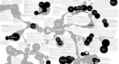
'Complex Net Art Diagram: A Remix' of MTAA is a remix of MTAA's simple net art diagram, linkoln.net have created the complex version. . It's a map, a history, and a parody of one hundred things: net art and net art's various historicisations, diagrams per se, histories per se, anything at all done in a totalising spirit, etc.
The Paris-based artists Léonore Bonaccini and Xavier Fourt form the artist-duo Bureau d´études. For the last several years, the French Group has been producing cartographies of contemporary political, social and economic systems. The visual analysis of transnational capitalism is based on extensive research and usually is presented in the form of large-sized murals.
‘Governing by Networks’, a chart produced in 2003, visualizes the mutual involvements and dependencies within the global media conglomerates. Revealing what normally remains invisible and contextualising apparently separate elements within a bigger whole, these visualizations of interests and cooperations re-symbolize the unseen and hidden.”
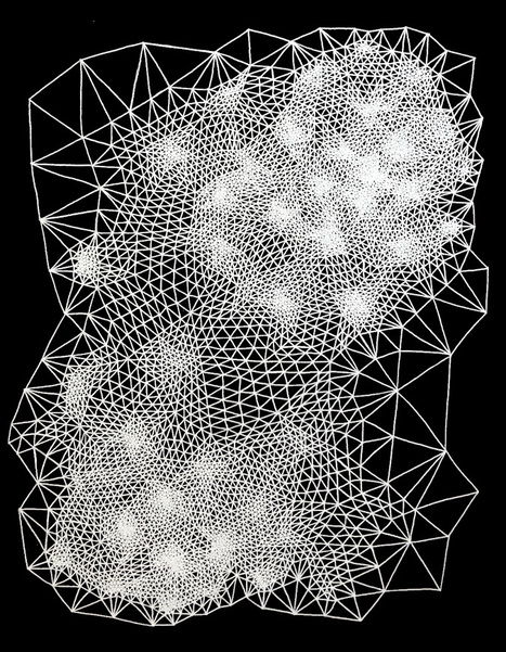
Clint Fulkerson is an artist from Maine who began his career with a degree in metal smithing. As a metalsmith he said he learned to become slow and precise which was the opposite to the painting he was doing at the time with broad gestural strokes. This became his new method of working and he now forces himself to “slow down and consider each moment in the present” which allows him to think about the influences of his work that range from science and math to information technology.With information technology, math, science and precision on his mind Fulkerson draws works that are remissent of tesselation (tiling) patterns that fit perfectly together. The drawings evolve based on rules that he has developed which define the placement of each mark. While his personal algorithms are the overriding design each work begins at a random place and then evolve as he works.
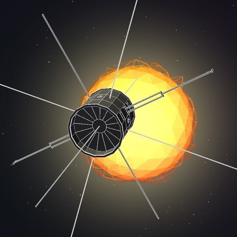
Dennis Wingo and Keith Cowing formed the ISEE-3 Reboot Project, a crowdfunded effort to attempt to get in contact and gain control of the decommissioned spacecraft for the benefit of citizen science. The team raised almost $160,000 in funding, and assembled top space experts for the cause. In May 2014, they began successfully communicating with the spacecraft in advance of its August 10th lunar flyby.
This post was originally published on the blog for the Centre de Cultura Contemporania de Barcelona. There is a great deal of excitement around the impact of ‘big data’ on innovation and growth: more data and improved analysis methods can help organisations to create new products and services, and optimise their decision-making capacity. In this […]
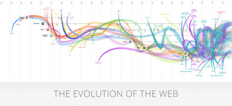
Interactive infographic about the evolution of browsers and the web. This infographic features major web browsers since 1993 such as Mosaic, Netscape, Opera, Internet Explorer, Safari, Firefox and Chrome as well as key developments in web technologies such as HTML, CSS and JavaScript.
The web today is a growing universe of interlinked web pages and web apps, teeming with videos, photos and interactive content. What the average user doesn't see is the interplay of web technologies and browsers that makes all this possible.�
Over time, web technologies have evolved to give web developers the ability to create new generations of useful and immersive web experiences. Today's web is a result of the ongoing efforts of an open web community that helps define these web technologies, like HTML5, CSS3 and WebGL, and ensure that they're supported in all web browsers. The colour bands in this visualisation represent the interaction between web technologies and browsers, which brings to life the many powerful web apps that we use daily.
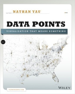
Whether it's statistical charts, geographic maps, or the snappy graphical statistics you see on your favorite news sites, the art of data graphics or visualization is fast becoming a movement of its own. In Data Points: Visualization That Means Something, author Nathan Yau presents an intriguing complement to his bestseller Visualize This, this time focusing on the graphics side of data analysis. ...
|
Les données sont aujourd’hui un enjeu essentiel. En art, elles sont à la fois point de départ et matériau d'oeuvres contemporaines ainsi que de nouvelles methodologies de recherche. Nous proposons d’aborder cette question par un dialogue entre un artiste et un chercheur. Fabien Zocco, artiste diplômé du Fresnoy en 2016, présentera sa démarche basée sur les données, et en particulier ses créations à partir de twitter et google street view. Clarisse Bardiot reviendra sur le programme Culture Analytics qu’elle a suivi en 2016 à la UCLA (avec entre autres Lev Manovich) et les enjeux de ce nouveau champ disciplinaire pour la recherche sur l’art. ...
Through a series of 15 hypotheses, this Critical Atlas of Internet aims to develop 15 conceptual spatialization exercises. The purpose of the atlas is to use spatial analysis as a key to understanding social, political and economic issues on Internet. The atlas seek to discern the shape of the Internet in order to understand the concrete issues and stakes involved.
A theoretical and visual research led and developed by Louise Drulhe within the context of her graduation project at EnsAD Paris.
Appel pour une résidence artistique et le développement d’un projet de création multimédia à partir des archives du Mundaneum Le présent appel à projet s’inscrit dans un partenariat entre La SCAM, le Mundaneum (dont les archives personnelles des fondateurs Paul Otlet et Henri La Fontaine, sont désormais dans le domaine public), et Transcultures (Centre des cultures numériques et sonores). Le PILEn (Partenariat Interprofessionnel du Livre et de l’édition numérique) s’associe également à cette opération. L’objectif de cet appel est de susciter la création d’un projet original d’art numérique à caractère expérimental et/ou documentaire à partir ou autour des archives du Mundaneum par l’attribution d’une aide à l’écriture ou au développement et d’une résidence de travail. deadline : les dossiers devront être envoyés au plus tard le 30 juin 2016.
Burak Arikan is a New York and Istanbul based artist working with complex networks. He takes the obvious social, economical, and political issues as input and runs through an abstract machinery, which generates network maps and algorithmic interfaces, results in performances, and procreates predictions to render inherent power relationships visible and discussable. Arikan’s software, prints, installations, and performances have been featured in numerous exhibitions internationally. Arikan is the founder of Graph Commons collaborative network mapping platform. Arikan has presented his work internationally at institutions including Museum of Modern Art New York, Venice Architecture Biennale, São Paulo Biennial, Istanbul Biennial, Berlin Biennial, Sharjah Biennial, Marrakech Biennial, Ashkal Alwan, Ars Electronica, Sonar, DEMF, Neuberger Museum of Art, KW Institute for Contemporary Art, Kunstmuseum Bochum, Asia Art Archive, Borusan Contemporary, DEPO, ARTER, SALT and at independent venues such as Art Interactive Cambridge, Künstlerhaus Bethanien, Hafriyat, Turbulence (online). He has lectured and did workshops at institutions including Massachusetts Institute of Technology, Rhode Island School of Design, New York University Interactive Telecommunications Program, The New School, Istanbul Technical University, Bogazici Universtiy, Sabanci University, and Istanbul Bilgi University. Arikan completed his master’s degree at the MIT Media Laboratory in the Physical Language Workshop (PLW) led by John Maeda. Prior to MIT, he received an MA degree in Visual Communication Design from Istanbul Bilgi University in 2004, and a BS degree in Civil Engineering from Yildiz Technical University in 2001.
I present a number of core concepts from data science that are relevant to digital art history and the use of quantitative methods to study any cultural artifacts or processes in gen-eral. These concepts are objects, features, data, feature space, and dimension reduction. These concepts enable computational exploration of both large and small visual cultural data. We can analyze relations between works on a single artist, many artists, all digitized production from a whole historical period, holdings in museum collections, collection metadata, or writings about art. The same concepts allow us to study contemporary vernacular visual media using massive social media content. (In our lab, we analyzed works by van Gogh, Mondrian, and Rothko, 6000 paintings by French Impressionists, 20,000 photographs from MoMA photo-graphy collection, one million manga pages from manga books, one million artworks of con-temporary non-professional artists, and over 13 million Instagram images from 16 global cities.) While data science techniques do not replace other art historical methods, they allow us to see familiar art historical material in new ways, and also to study contemporary digital visual culture...
Eric Fischer is data artist and software developer at Mapbox. He was an artist in residence at the Exploratorium in San Francisco, and software engineer on the Android team at Google.
What’s big data? until not long ago, we looked at the abundance uf urban data as an enormous lists of numbers unconnected, difficult to manage or as an academic or research papers. But our way of seeing and understanding big data has changed, while we discover how some people, artists, researchers “geeks” use this urban data in order to create new ways of undesrtanding the society. ... The pionner on mapping big data will attend to Technarte 2015 to talk about his work in Big Data and Art. ...
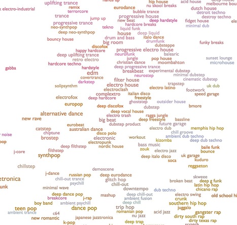
This is an ongoing attempt at an algorithmically-generated, readability-adjusted scatter-plot of the musical genre-space, based on data tracked and analyzed for 1374 genres by The Echo Nest. The calibration is fuzzy, but in general down is more organic, up is more mechanical and electric; left is denser and more atmospheric, right is spikier and bouncier.
The development of digital technologies has brought fundamental changes into our lives, cultures and societies. Social networking media user generated sites and peer-to peer networks have contributed to the development of a new participative culture where users have access to tools to create and share contents with peers. As web users, we spend significant time online, searching for contents and visiting numerous web pages. These actions leave traces that can be collected, typically within web server logs. These data represent potential sources of valuable information for various private and public purposes.
Commercial companies have well understood how useful the above mentioned data can be if properly analyzed and transformed into exploitable information for their targeted audiences. Meaningful analysis, representation and comparison of actions, habits and navigation history of web users can help them to better understand and exploit the knowledge that these data contain.
However, in most cases, users cannot access the generated information that is kept private although the original data have been created by the users themselves...
Si Wikipedia peut être un cosmos à lui tout seul de par les millions d’articles et connaissances qui y sont stockés. Owen Cornec, jeune étudiant français, a eu l’idée géniale de créer un nouvel astre lumineux de l’encyclopédie en ligne pour en faire un immense réseau interactif d’articles nommé WikiGalaxy. Se retrouver dans un réseau d’étoiles fait de milliers d’informations n’est pas simple et les liens deviennent des chemins intersidéraux – presque performatif – menant d’une découverte à une autre. ....
http://wiki.polyfra.me
From operating systems to development tools and programming languages to browsers and thousands of utilities and applications, Open Source has led the way. Now, discover the movement's history.
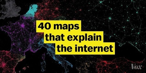
Where the internet came from, how it works, and how it's used by people around the world
Worldmapper is a collection of world maps, where territories are re-sized on each map according to the subject of interest.
There are now nearly 700 maps. Maps 1-366 are also available as PDF posters. Use the menu above to find a map of interest. In 2009 we added a series of maps of the world's population using a gridded cartogram approach: Worldmapper Population Atlas
If you are interested in more background on map projections, read the short introductions about Worldmapper and map projections and gridded cartograms as a map projection.
|