Amazing Science
1.1M views | +27 today
Follow
Amazing Science
Amazing science facts - 3D_printing • aging • AI • anthropology • art • astronomy • bigdata • bioinformatics • biology • biotech • chemistry • computers • cosmology • education • environment • evolution • future • genetics • genomics • geosciences • green_energy • language • map • material_science • math • med • medicine • microscopy • nanotech • neuroscience • paleontology • photography • photonics • physics • postings • robotics • science • technology • video
Your new post is loading...
Rescooped by Dr. Stefan Gruenwald from Fantastic Maps
Scoop.it!

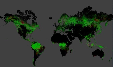
These maps show where the Earth’s forests are vanishing

These maps show where the Earth’s forests are vanishing | Amazing Science | Scoop.it
Brazil has managed to cut deforestation in half since 2000. But that's been offset by increasing forest loss in other countries.


Results from time-series analysis of Landsat images characterizing forest extent and change. Trees are defined as vegetation taller than 5m in height and are expressed as a percentage per output grid cell as ‘2000 Percent Tree Cover’.


‘Forest Cover Loss’ is defined as a stand-replacement disturbance, or a change from a forest to non-forest state, during the period 2000–2018. ‘Forest Cover Gain’ is defined as the inverse of loss, or a non-forest to forest change entirely within the period 2000–2012. ‘Forest Loss Year’ is a disaggregation of total ‘Forest Loss’ to annual time scales.


Reference 2000 and 2018 imagery are median observations from a set of quality assessment-passed growing season observations.


You can inspect the maps in closer detail at this site.


Via Seth Dixon
No comment yet.
Scooped by Dr. Stefan Gruenwald
Scoop.it!

New map details threat of Zika across Europe and U.S.

New map details threat of Zika across Europe and U.S. | Amazing Science | Scoop.it

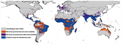
With Zika sparking anxiety at the Summer Olympic Games in Brazil, and now being transmitted in Florida through contact with mosquitoes, accurately mapping the distribution of the virus is increasingly urgent.

Accounting for a host of often-overlooked drivers of transmission, a team of University of Kansas researchers has mapped Zika risk around the world with unprecedented resolution while considering more factors than previous models.  

The mapping effort uses ecological niche modeling, a technique used to predict distributions of species, to show the virus’ powerful ability to spread in South and Central America.
This study is the first to evaluate the risk of Zika virus transmission in Europe, which appears relatively low. Research suggests parts of the southern U.S., including parts of Florida, Texas and Louisiana, are vulnerable to transmission of the virus.


“It’s the first detailed map that weighs different drivers of transmission,” said Abdallah Samy, who headed the research at the KU Biodiversity Institute. “We assessed different combinations of variables to see what are the major drivers — such as climate, or socioeconomics or people’s ability to access certain areas — and in the final map we merge all the variables.”

The resulting map predicts the likelihood of Zika exposure in the coming years by segmenting Earth’s landmasses into squares of 5-by-5 kilometers each and crunching the numbers for each of them.

Multiple factors influence risk assessment because the virus can spread through contact with mosquitoes in the genus Aedes, person-to-person via sexual contact, through blood transfusions and mother-to-child during pregnancy. The study focused on mosquito-driven transmission.

“For each area, we asked, ‘Is it mosquito exposure, climate or socioeconomic variables like accessibility for people to travel from areas where Zika is endemic and spread the virus upon their return?’” said Samy, who earned a doctorate in ecology and evolutionary biology at KU in May.

The findings recently were posted to the Zika Fast Track site and published in Memórias do Instituto Oswaldo Cruz, an international journal of biological and biomedical research based in Brazil, where the current outbreak has been centered since 2015.

No comment yet.
Rescooped by Dr. Stefan Gruenwald from Research Workshop
Scoop.it!

Beautiful Maps Show the World's Oceans in Motion

Beautiful Maps Show the World's Oceans in Motion | Amazing Science | Scoop.it
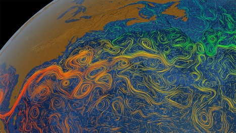
These maps from NASA show ocean currents around the world.


The world's oceans are in constant motion, and this series of maps published by the NASA/Goddard Space Flight Center Scientific Visualization Studio helps provide us with a nice illustration of this movement. The maps, which were created at various times in past years, show the many warm and cold ocean currents responsible for transporting water across long distances throughout the world's oceans.


In addition to the ocean currents, you can also see swirly features, known as ocean eddies, on the maps. An ocean eddy is formed when currents sometimes pinch off into sections, creating the circular current. Sometimes significant eddies are given names, according to NOAA.


Below we have selected a few of the maps from NASA's collection, accompanied by a brief explanation of what you are seeing.

In addition to a large-scale view of ocean circulations and eddies across the world, you can also see water temperatures in this image. The orange and red shadings in the middle of the map correspond to the warmer waters in tropics. Cooler waters depicted in green and blue are located north and south of this as you head towards the poles.


Via Suvi Salo, Mark E. Deschaine, PhD, Jocelyn Stoller
No comment yet.
Rescooped by Dr. Stefan Gruenwald from Polymath Online
Scoop.it!

100 Years Of Historical Earthquake Data - Graphical Map

100 Years Of Historical Earthquake Data - Graphical Map | Amazing Science | Scoop.it
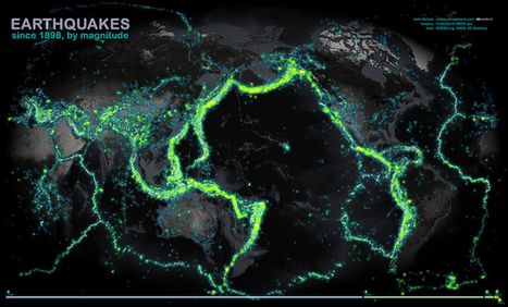
This map of all the world's recorded earthquakes between 1898 and 2003 is stunning. As you might expect, it also creates a brilliant outline of the plates of the Earth's crust—especially the infamous "Ring of Fire" around the Pacific Plate.


The plate boundaries are amazingly vivid in this geovisualization of the all the earthquakes over  a 105 year span.  How did scientist orginally come up with the theory of plate tectonics?  How did spatial thinking and mapping play a role in that scientific endeavor?


Via Martin Daumiller
No comment yet.
Rescooped by Dr. Stefan Gruenwald from Everything is related to everything else
Scoop.it!

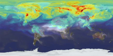
Top 11 maps that ultimately explain climate change and its impact

Top 11 maps that ultimately explain climate change and its impact | Amazing Science | Scoop.it
Scientists and politicians all agree – climate change and global warming are not just myths. They are a fact. This compilation of maps will show you what are the reasons behind it and what are the consequences of that process.

Via Fernando Gil
No comment yet.
Scooped by Dr. Stefan Gruenwald
Scoop.it!

Scientists map the global spread of HIV through the Western world and beyond

Scientists map the global spread of HIV through the Western world and beyond | Amazing Science | Scoop.it
For the first time, an international team of scientists from the European Society for Translational Antiviral Research (ESAR) has mapped the spread of the HIV virus around the globe after it reached the United States in the early 1970s.


The major study, published in the Journal of Molecular Epidemiology and Evolutionary Genetics of Infectious Diseases (MEEGID), finds that HIV travelled from the US to Western Europe on a number of occasions, whereas Central and Eastern Europe remained isolated for the most part of the early epidemic.


Analysis of thousands of genome sequences shows that geopolitical events such as the fall of the Iron Curtain had a big impact on human migration patterns within Europe and thus the spread of the virus through the continent.


Co-lead author Dr Gkikas Magiorkinis, of the Department of Zoology at Oxford University, said: 'The story of HIV up to its arrival in the US is already known. What happened after that, however, has been unclear. We wanted to see how HIV spread in the Western world.


'One of our main findings is that North America was spreading the virus much more than importing it, whereas Europe was absorbing the infection.'


Co-lead author Assistant Professor Dimitrios Paraskevis, of the Department of Hygiene, Epidemiology and Medical Statistics at the National and Kapodistrian University of Athens, said: 'Another striking finding is the clear segregation between Eastern and Western Europe in the early days of the virus, which probably has to do with the political situation on the continent. These distinct strains in Eastern and Western Europe were able to connect again in the 1990s once movement became less curtailed.'


Human immunodeficiency virus type 1 (HIV-1) was discovered in the early 1980s, when the virus had already established a pandemic. For at least three decades the epidemic in the Western world has been dominated by subtype B infections as part of a sub-epidemic that travelled from Africa through Haiti to the US. However, the pattern of the subsequent spread still remains poorly understood.


The researchers analysed almost 9,000 genomes of globally representative HIV-1 subtype B strains to map their spread around the world over the past 50 years and to highlight any significant spread patterns. They show that subtype B travelled from North America to Western Europe on different occasions, while Central and Eastern Europe remained isolated for the most part of the early epidemic.


Looking at Europe in more detail, the study shows that the UK, France and Switzerland all exchanged viral isolates more often with non-European countries than with European ones. The observed pattern is likely to mirror geopolitical landmarks in the post-World War II era – namely, the rise and fall of the Iron Curtain – and traditional links between countries as a result of European colonialism.


HIV-1 therefore spread along specific migration routes that are consistent with geopolitical factors that affected human activities during the past 50 years, such as migration, tourism and trade. The researchers say their findings support the argument that epidemic control policies should be global and incorporate political and socioeconomic factors.

No comment yet.
Rescooped by Dr. Stefan Gruenwald from anti dogmanti
Scoop.it!

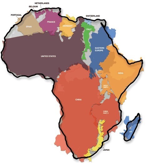
The True Size Of Africa

The True Size Of Africa | Amazing Science | Scoop.it

This is another old classic image that I might have shared earlier but it merits repeating. As Salvatore Natoli (a leader in geography education) once said, "In our society we unconsciously equate size with importance and even power." This is one reason why many people have underestimated the true size of Africa relative to places that they view as more important or more powerful.


Via Sue Tamani
Afrikasources's curator insight, January 15, 2014 10:10 AM

Just a reminder

Maria la del Varrio's curator insight, December 5, 2014 11:01 AM

It is incredible big, but unfortunately most of the north area is cover by the big Sahara and most of the are is typically unfertilized. 

Jason Schneider's curator insight, March 9, 2015 4:29 PM

As we can see, there's a little overlapping here and some empty spots but it's pretty accurate. The United States and China are in the top 5 largest countries of the world list and they still fit in the 2nd largest continent of the world, Africa. I'd like to see the size comparison between Africa and Russia. I did some research on that and it turns out that Russia is a little over half the size of Africa, maybe the size of the combination of the United States and China.

Scooped by Dr. Stefan Gruenwald
Scoop.it!

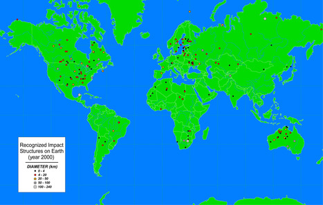
Map of Most Meteorite Craters in the World

Map of Most Meteorite Craters in the World | Amazing Science | Scoop.it

Recognized impact structures throughout the world

No comment yet.