 Your new post is loading...

|
Scooped by
Marteq
|
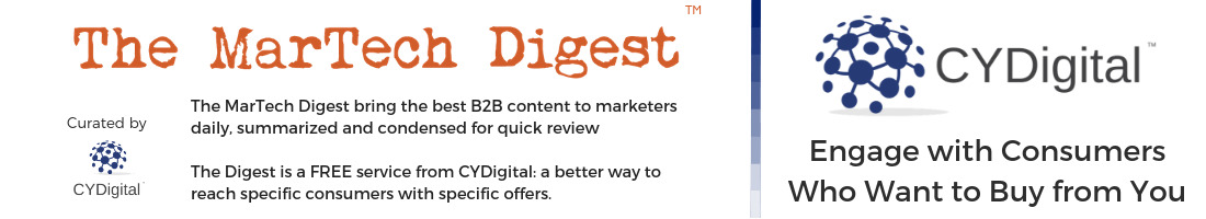
While the return on investment (ROI) for each organization will differ depending upon the efficiency of the practice, the project, and the specific use case, Forrester's Total Economic Impact (TEI) model found that mature design thinking practices can generate substantial measurable returns and a broad range of auxiliary benefits.
Using both primary and secondary research, Forrester modeled the financial impact of design thinking practices at four fictional, “composite” organizations in banking, insurance, retail, and subscription services.
The synthesized results project a median per-project ROI of 229%, with three-quarters of projects doubling their investment or more. Examined at an organizational level, a mature design thinking practice can achieve an ROI between 71% and 107%, based on a consistent series of inputs and outputs.
|
|
Scooped by
Marteq
|
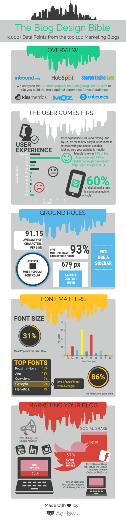
The Creative Trends Report for 2018 is here -- discover which design trends are predicted for this year.
|
|
Scooped by
Marteq
|
1. Organic: Interestingly, organic design stands in contradiction to the mainstream desire for clean, minimalist design. For example, we see it manifested in vintage design, which can help brands achieve a top-shelf look with classic details that provide an air of distinction and sophistication.
2. Mobile-First: Design trends in previous years highlighted a responsive approach to website design—which is still important—but in 2018 we'll think about smartphones before we think about desktops. Companies are going to think about how their site looks on an iPhone and transition that experience onto the desktop, rather than vice-versa.
3. Movement: 2017 was, believe it or not, the 30th anniversary of the GIF. As adoption among marketers and consumers continues to grow, we see this trend continuing into 2018. And, let's face it, there have been many world events and resulting emotions this past year to which words alone cannot do justice. GIFs add interest to ads, email newsletters, illustrations, icons, and logos (not to mention memes).
4. Complexity: Over the last few years, flat design has reigned supreme, but gradients are making a big comeback in 2018, bringing back complexity and depth we haven't seen in recent times. Last time gradients were around, they were seen mainly in the form of Material Design and subtle shading to suggest 3D (Apple's iOS icons were a great example). Now, gradients are big, loud and full of color.
|
|
Scooped by
Marteq
|
Typically, when companies look to improve their conversion rates, they focus on their CTA buttons or value propositions. Businesses also lik
|
|
Scooped by
Marteq
|
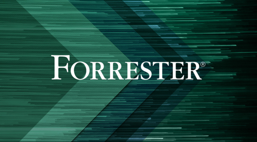
Acorn
Key Features: Layer styles, number of filters, curves and levels, blending modes, brush designer
Supported File Formats: Native file format .acorn, JPG, PNG, GIF, PSD, SVG, RAW, PSD
Supported Platforms: Mac OS X
Price: Paid
Paint.NET
Key Features: supportive tools, layers, curves and brightness, simple photo editing
Supported File Formats: RAW, BMP, JPEG, GIF, PNG
Supported Platforms: Windows
Price: Free
Sumo Paint
Key Features: Layer Effects, Professional painting tools, Filters, Gradient tools, Selection and Shape tools, Image Enhancement, Clone Stamp tool
Supported File Formats: JPEG, PNG, GIF
Supported Platforms: Browser or iPad (Web Based)
Price: Free for basic, Paid for pro version
Seashore
Key Features: Layers, 6 Gradients, Brushes, Image Editing tools, Anti-aliased Brush
Supported File Formats: JPEG, PNG, TIFF, XCF, PDF
Supported Platforms: Mac OS X
Price: Free
Adobe Photoshop Express
Key Features: Simplicity, Optimized for touch, compact to be handled with fingertips
Supported File Formats: JPG, Raw, TIFF
Supported Platforms: Windows, iOS, Android
Price: Free
|
|
Scooped by
Marteq
|
When you are in a hurry, finding a nice place to download the icon you need at the moment may be a problem. Do not panic! Here is a list of the best icons collections where you can find awesome vector icons for any occasion free of charge. Just follow the link and choose what you need from the multitude of stunning icons.
|
|
Scooped by
Marteq
|
1. Keep it succinct
2. Proper punctuation is a must
3. Include the text that is present in the image
4. Don’t ‘COPY and PASTE’ image captions
5. Count on context
6. Quotes are not needed
7. Distinguish the decorative images
8. Test
9. Style it a little
10. Innovate
|
|
Scooped by
Marteq
|
Neuromarketing can become a great tool in web design and marketing if it is wisely used. We have conducted a research tha
|
|
Scooped by
Marteq
|
SoDA serves as a network and voice for entrepreneurs and innovators around the globe who are creating the future of marketing and digital experiences.
|
|
Scooped by
Marteq
|
Every decision your business faces – choosing between a red or green purchase button or redesigning your website – has been encountered by hundreds of marketers before you.
|
|
Scooped by
Marteq
|
Find out how to make sure your website redesign is a success.
|
|
Scooped by
Marteq
|
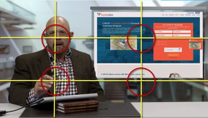
The rule of thirds is one of the first principles that all graphic designers, videographers, photographers and other creative roles learn. It’s a basic guideline for framing and image composition that results in the viewer seeing a balanced, more naturally flattering image.
To apply the rule, take your image and divide it into three parts vertically and again horizontally (it should look similar to a tic-tac-toe board.)
The rule states that the audience’s eye is naturally more drawn to the areas of the image nearest the intersection points. So, when you’re designing an image for a landing page, a social post, a PowerPoint slide, or even if you’re shooting a video, be sure to put the most important pieces of your image near these intersection points.
|
|
Scooped by
Marteq
|
MotoCMS
Ucraft
Weebly
Jimdo
Yola
Wix
Webs
Strikingly
Squarespace
Voog
|
|
Scooped by
Marteq
|
1: Red
2: Blue
3: Green
4: Purple
5: Black
6: Orange
|
|
Scooped by
Marteq
|
- Background images not supported
- Animated GIFs do not work
- Additional padding below images
- DPI Scaling
- Additional page break
- Links getting converted to purple or blue
- No support for position and float
- Rendering CSS issues
|
|
Scooped by
Marteq
|
Numerous eye-tracking studies have been done using heat maps, saccade pathways and other methods. These studies reveal that web visitors tend to view content in three distinct patterns:
- Z pattern: As you would suspect, the eye starts at the top-left of the page in a Z formation until it reaches the bottom-right.
- F pattern: Again, the eye starts at the top left and moves across the page to the right, then moves down a little and repeats the movement.
- Gutenberg diagram: You guessed it. This pattern also starts at the top left but moves in a straight diagonal to the bottom right, more or less ignoring the other corners.
|
|
Scooped by
Marteq
|
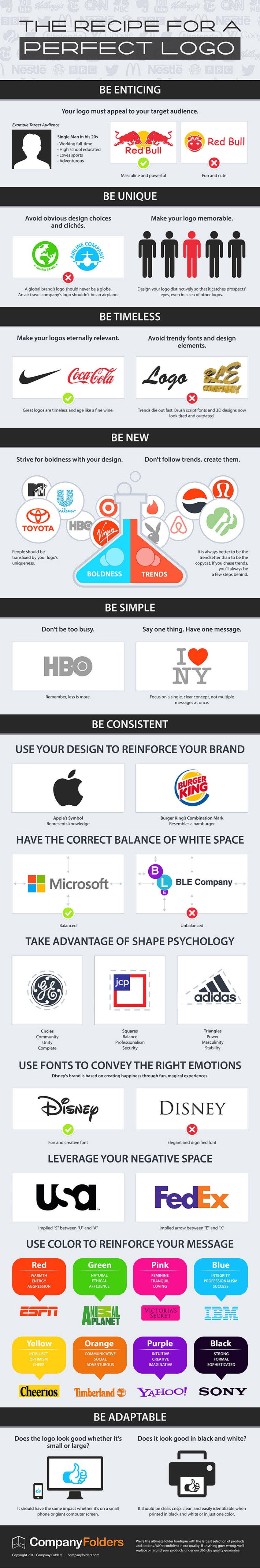
Are you making first steps in creating logo designs? Read this article with a list of special recommendations and download an awesome infographic free.
|
|
Scooped by
Marteq
|
1. Know less is more
2. Strike a balance
3. See the color
4. Think about typography
5. Don’t let page-load time deter visitors
|
|
Scooped by
Marteq
|
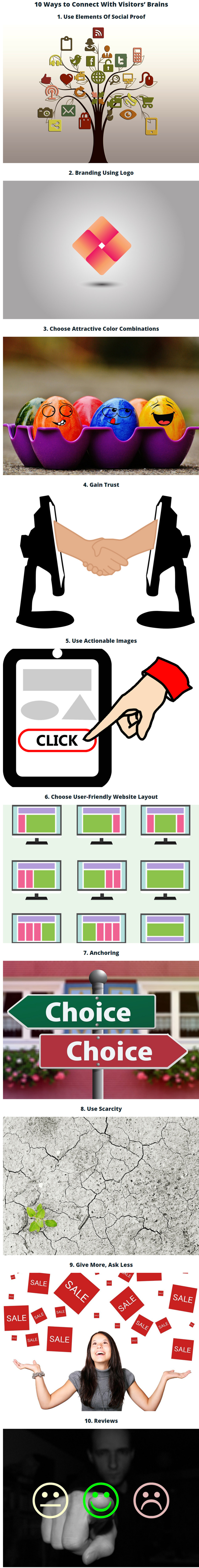
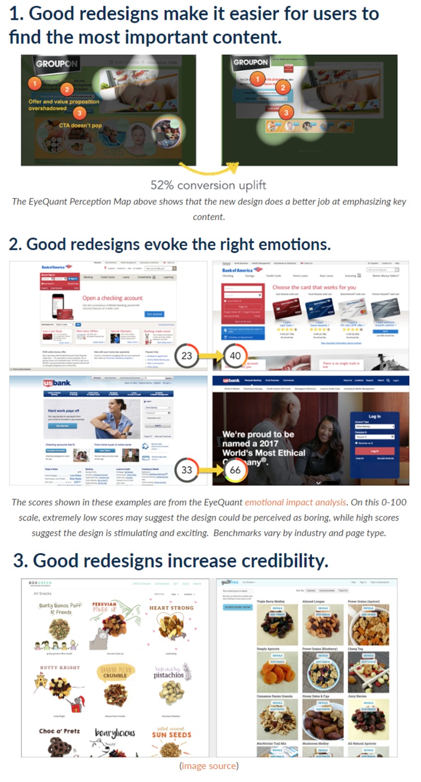
- A new layout: In addition to a complete overhaul of the visual elements of the page, we took a look at the sections on the page and evaluated the importance of each.
- Icons: The icons on our different plans help page visitors quickly understand who each plan is made for, while also serving to “jazz up” (I know, that phrase is a design no-no) an otherwise text-centric section of the page.
- A testimonial carousel: We knew we greatly valued the effect of social proof, so we decided to double down on testimonials by creating a carousel of them on this page.
- Bullet-point features: Putting together a list of our features for unacquainted potential customers makes it easy for them to see Wishpond’s benefits with only as much copy as we need.
|
|
Scooped by
Marteq
|
|
|
Scooped by
Marteq
|
The journey of email trends takes the Monks back to the email design trends of 2016 that made an impact, and with those in mind let’s understand what the scope for emails is, in 2017:
- Light-weight GIF has dominated the emails sent in 2016. These GIFs aren’t very heavy in file size like a video but still have the power to make an impact with gradual animation.
- Flat Design in Emails inspires to maintain a continuity to the recent UI that has been observed in both Android and iOS platforms.
- Minimalistic Email Design has been adopted in brand logos, websites and also email designs. It includes reduced elements combined with minimal text to add relevant context in emails.
- Unconventional Email Template Design is all about creating email template designs that surprise and delight subscribers. These are rare but STAND OUT.
- Email Master Templates are great when it comes to easing the process of designing, and coding similar looking email templates to fasten the process. It aids in giving your brand a consistency which in-turn enables subscribers to connect well with your brand.
|
|
Scooped by
Marteq
|
|
|
Scooped by
Marteq
|
1. Poor design
2. Unnoticeable calls to action
3. Using trashy or cliché stock photos
4. Lack of Hierarchy
Not only should the images be authentic and relevant, but also the hierachy. Without an attractive and informative heading and hierarchy on your landing page, users will be confused.
5. No social or user trust cues
6. Too much text
|
|
Scooped by
Marteq
|
1. Streamline Your Design
2. Make Content Easy to Read
3. Pick the Right Palette
4. Choose Fonts Wisely
5. Play With Symmetry
6. Don’t Forget About Quality Imagery
7. Optimize Your CTA Button: When there is a specific action you want a visitor to take, you have to make it easy for them to take that action. Your CTA button needs to be foolproof. There are a few tweaks you can make to create a CTA button that converts.
|
|
Scooped by
Marteq
|
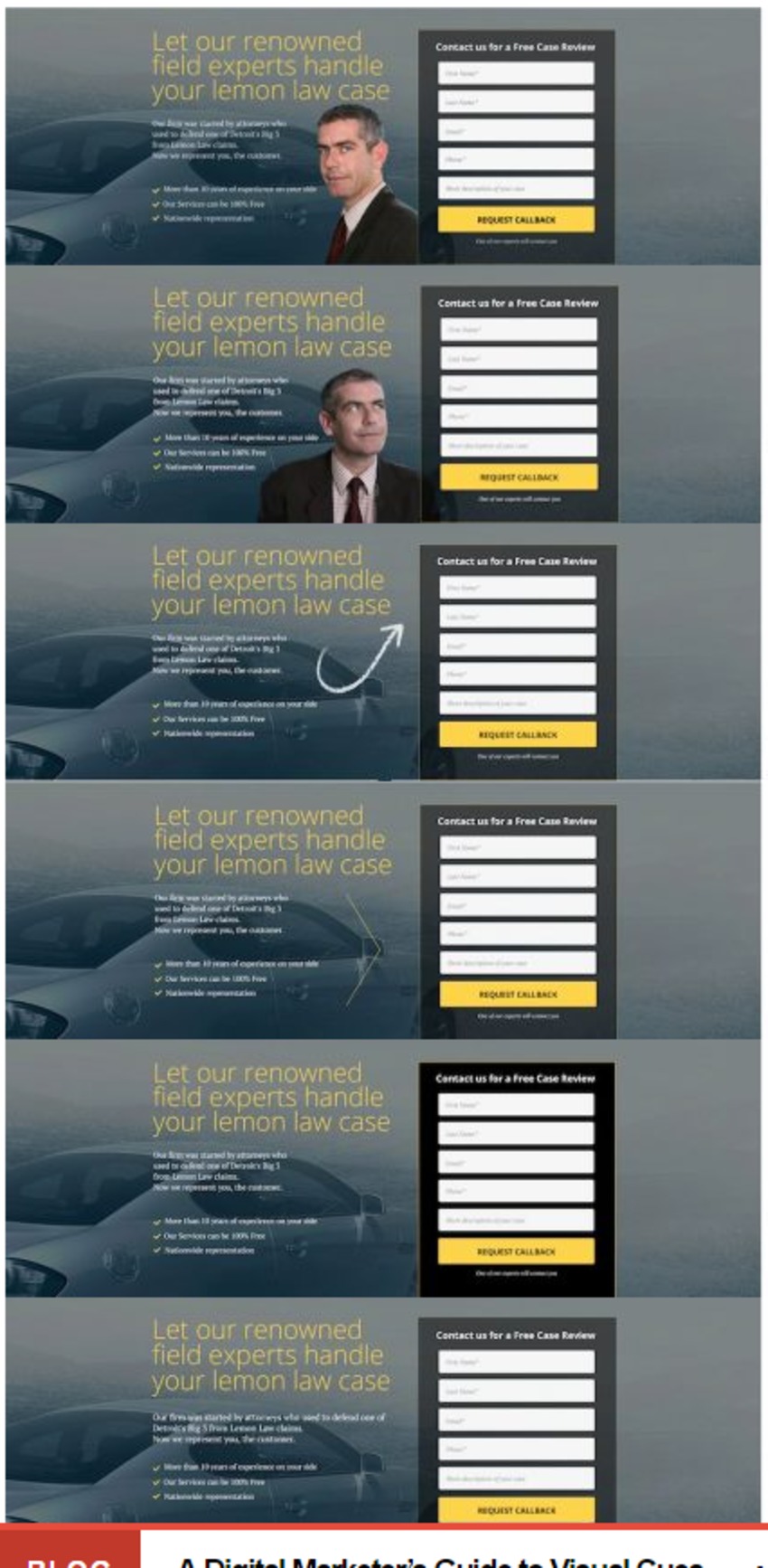
The visual cues did impact how much a user pays attention to the form.
- The hand-drawn arrow resulted in the longest amount of time on the form.
- The human looking away from the form resulted in the shortest.
So, while every site is different, here’s some empirical data that says you should perhaps test hand-drawn directional objects (e.g. an arrow) for guiding the attention of users.
Also, if you use an image of a human as a visual cue, have this person looking in the direction of the CTA or key feature. The human looking away was the worst in terms of fixation time.
|
|


![Here Are the Top Marketing Design Trends for 2018 [Infographic] - HubSpot | The MarTech Digest | Scoop.it](https://img.scoop.it/At98U5uteHb3-hyRsM2ZEfL6dadsvGA8m9WNoVsbzkY=)


![Web Design Trends to Watch in 2017 [Infographic] - ShortStack | The MarTech Digest | Scoop.it](https://img.scoop.it/Bo1Dg_3gt_2lqcbjmQ2JIfL6dadsvGA8m9WNoVsbzkY=)


This is incredibly significant, and deserves greater attention and study.
Curated by CYDigital: enabling Consumers to capture, share and profit from their data. https://cyd.digital #zeropartydata #dataprivacy