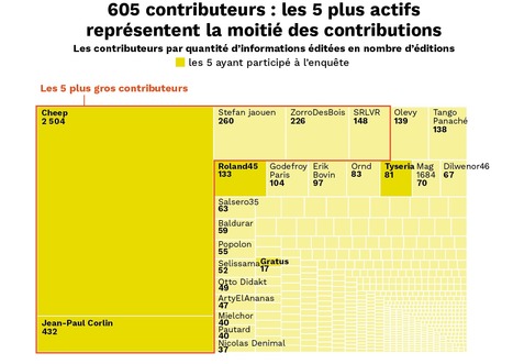
Le récit d’une enquête data menée grâce aux archives d’une page Wikipédia. Retrouvez cette enquête dessinée par Vincent Sorel dans @LaRevueDessinee actuellement en vente
Get Started for FREE
Sign up with Facebook Sign up with X
I don't have a Facebook or a X account


 Your new post is loading...
 Your new post is loading...
Your new post is loading...
Le récit d’une enquête data menée grâce aux archives d’une page Wikipédia. Retrouvez cette enquête dessinée par Vincent Sorel dans @LaRevueDessinee actuellement en vente 
No comment yet.
Sign up to comment

Pendant les questions au gouvernement, certains députés se sont fait une spécialité de jouer les élèves dissipés… Voici leurs noms.
![2018 : l'infographie bilan de Futur.e.s [by @we_do_data] | Journalisme graphique | Scoop.it](https://img.scoop.it/G3NzNUSQhsi1g3McV1mTCjl72eJkfbmt4t8yenImKBVvK0kTmF0xjctABnaLJIm9)
Ancienne « halle aux bœufs » construite entre 1865 et 1867, le bâtiment appelé aujourd’hui « Grande Halle de la Villette » était la plus grande des trois halles de vente aux bestiaux et la seule à avoir été conservée à son emplacement initial. Elle fut conçue par l’architecte Jules de Mérindol (1815-1888), élève de …

HEy hey hey hello welcome to this session, please take a sit… I brought some almond cookies from the French West Coast, go on help yourself… Shall we start? LATEST TRENDS IN DATA JOURNALISM at #EIJC18 Marianne Bouchart Data Journalism Awards Manager Founder and director of HEI-DA
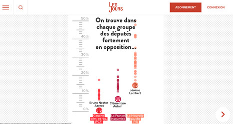
Les députés des trois groupes de gauche s’opposent au gouvernement, bien sûr… Mais pas tous, pas tout le temps, pas sur tout. La preuve en données.
Sur wedodata.fr, on vient d'ouvrir "Made", un espace très particulier qui regroupe les réalisations initiées à 100% par WeDoData : infographies, outils ou projets de R&D, découvrez la créativité
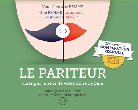
Application Le Pariteur : Changez le sexe de votre fiche de paie. Edition 2018 : Découvrez le Comparateur régional

Découvrez un Grand Paris inédit en huit Grands Quartiers : le Rooftop, l'HyperMuseum, la Fabrique, la Petite Riviera, l'Océan Vert, la Street Galerie, le Delta et le Square XXL = 302 adresses à ne pas rater sur ce nouveau territoire en ébullition. WeDoData est fier d'accompagner la naissance du "Guide des Grands Parisiens" par Enlarge your Pariset les Magasins Généraux avec des data, du graphisme, des animations.
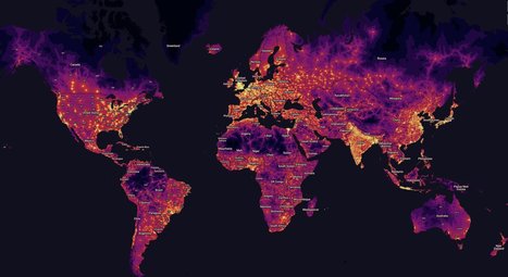
80.7% of the Earth's population lives within one hour of a city, but accessibility varies by wealth. In high-income countries 90.7% of the population lives within an hour of a city compared to just 50.9% in low-income countries*.
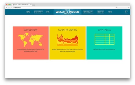
Alors que l'économiste Thomas Piketty dévoile aujourd'hui le Rapport 2018 sur les Inégalités Mondiales, découvrez le site conçu par WeDoData qui permet de naviguer dans la base mondiale des richesses et des revenus
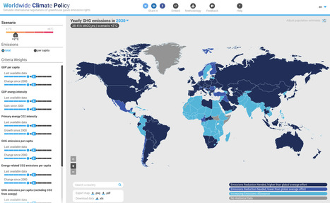
Put yourself in a climate negotiator’s shoes. Try www.worldwideclimatepolicy.eu
|

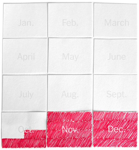
Depuis quelques années, les sites de revente mettent en avant une explosion des annonces juste après le passage du Père Noël, notamment pour les jouets et les vêtements et accessoires… Les produits high-tech sont-ils aussi concernés par ce phénomène ? Enquête sur 19 produits-phare à partir d’un mois d’analyse quotidienne du site LeBonCoin.

Une personne, une voix ? Dans son livre "Le prix de la démocratie",
From
medium

Après l’expérience Extrapol, l’application qui a transformé les affiches de la campagne présidentielle de 2017 en média, Wedodata continue d’explorer la réalité augmentée et son potentiel narratif…

Plongée dans les agendas du Président et du Premier ministre grâce à la base Screengov créée par
Resource Watch features hundreds of data sets all in one place on the state of the planet’s resources and citizens. Users can visualize challenges facing people and the planet, from climate change to poverty, water risk to state instability, air pollution to human migration, and more.
Cet article est un bon exemple du contenu que vous pouvez recevoir régulièrement dans votre boite mail si vous vous abonnez (gratuitement) à La Lettre des Nouvelles Narrations. — Nous vivons dans un monde de données, de plus en plus quantifiable, mesurable. Open-data et big data sont déjà devenues des marronniers médiatiques qui plongent certains dans …

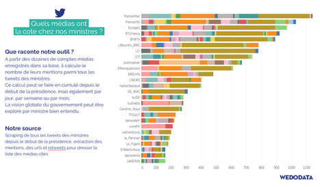
En quelques clics, il est facile de voir quel-le ministre parle le plus du président de la République sur Twitter. Nous l'avons fait, et voici les résultats.
The David Rumsey Map Collection, known for its many browsable historical maps, now has a “data visualization” subject tag. This means you can now quickly access over 1,000 charts that date back centuries. I’m not sure how long the browser has had the filter available, but I’m glad it does.
Paris, Lyon, Marseille : faites le test dans votre arrondissement
The median salary for women working full-time is about 80% of men’s. That gap, put in other terms, means women are working for free 10 weeks a year.
|