Must Design
75.5K views | +1 today
Follow
Must Design
Design Is Revolutionary
Your new post is loading...
Scooped by Martin (Marty) Smith
Scoop.it!

The Rise of Artificial Intelligence: How AI Changes UX Design | Creative Cloud blog by Adobe

The Rise of Artificial Intelligence: How AI Changes UX Design | Creative Cloud blog by Adobe | Must Design | Scoop.it

AI & UX and UI

Mobile isn't everything it is the only thing at least as far as data architecture and design goes. The "mobile first" movement didn't go nearly far enough. 

Mobile first means thinking about and changing how we think about User Interface design. As we're thinking about design we need to layer artificial intelligence (AI) in too. 

AI impacts the sentient nature of the conversation between customers, websites and robots. Robots not of the Skynet variety but crawlers determined to understand, share, and search. 

Martin (Marty) Smith's insight:

Mobile first isn't everything it is the only thing. This Adobe post provides an intelligent look into how AI will impact web design, user experience, and the customer journey. 

No comment yet.
Scooped by Martin (Marty) Smith
Scoop.it!

Genius Transitions In User Experience Design - Smashing Magazine

Genius Transitions In User Experience Design - Smashing Magazine | Must Design | Scoop.it
This article looks at some examples of interaction design in which smart interaction, defined by subtle animation, gently improves the user experience. We’ll share some lessons drawn from various models and analyze why these simple patterns work so well.


Martin (Marty) Smith's insight:

add your insight...


David Swaddle's curator insight, August 31, 2014 7:28 PM

This article got me thinking. It's about transitions in user interface design with some very nice animated examples.


Are the transitions shown here useful in a learning context, or are they merely window dressing that detracts from learnability? Personally, I think that while they look nice the first time, most of these transitions become annoying with time, simply delaying users. Mayer and others have shown how eye-candy can often be detrimental to learning.


Is it time for some generous academic to re-evaluate the situation in light of recent UX designs, preferably in a corporate setting? Or, maybe somebody already has and some kind soul could post here and point me in the right direction?

Scooped by Martin (Marty) Smith
Scoop.it!

RETHINK Web Design: Unusual Web Navigations Inspire | AWWWARDS

RETHINK Web Design: Unusual Web Navigations Inspire | AWWWARDS | Must Design | Scoop.it
Beautiful Unusual Navigation Designs for Inspiration. Selection of Awwwards websites with a strong presence of unusual navigation. An effective navigation design is crucial for a website
Martin (Marty) Smith's insight:

Navigation feels old and moldy. There are few things MORE critical than navigation. We've moved from left nav sitting firmly in the "golden triangle" to horizontal top navigation.

Neither of these options inspire and both are feeling long in the tooth and stupid. The social / mobile web requires a RETHINK about navigation. Can we find ways to make very page a homepage?

Can navigation be more relevant and less middle of the road boring? Here are some navigation examples from AWWWARDS.com that don't solve the problem...yet. But the dialogue helps begin the process of reducing our dependency on static, boring, "has-been" ideas like left or horizontal nav.

Are you as surprised that navigation hasn't been on the "top changes" list for web design in 2014? Has to be on our 2015 list because every current option is BAD and getting worse.

BOUTELOUP Jean-Paul's curator insight, June 27, 2014 2:21 AM

Merci ! il est bon de repenser aussi le webdesign pour une nouvelle expérience utilisateur

Scooped by Martin (Marty) Smith
Scoop.it!

Magic of the GRID: 60+ Website Grid Design Examples Inspire

Magic of the GRID: 60+ Website Grid Design Examples Inspire | Must Design | Scoop.it
There is no doubt that currently almost everything on the internet is becoming image-driven. If you think for a moment, it is only really catching up with print
Martin (Marty) Smith's insight:

Little did I know how prescient I was. In 1999 when I created FoundObjects.com (now gone sadly), one of the first B2B and B2C specialty gift sites,

I decided to use a Mondrian Grid that you can see on the WayBackMachine: http://web.archive.org/web/19991127134326/http://www.foundobjects.com/

I used Mondrian's grid because it was brand aligned to the FoundObjects.com's museum store customers. The grid also helped organize a lot of information. Organizing a LOT of information in an easy to understand pattern is the advantage of using a grid in your web design as these more than 60 examples show.

No comment yet.
Scooped by Martin (Marty) Smith
Scoop.it!

Birth of the Cool: 2012 UI, UX Design Trends

Birth of the Cool: 2012 UI, UX Design Trends | Must Design | Scoop.it

User Experience UX Software Design 2013 Trends. Agree, big 2013 design trends include:

* Visual Marketing & Design Simplicity (lean content, lots of Infographics and other data visualizations).

* Content Marketing heavily influenced by mobile first and mobile's content constraints (speed, small, UI).


Would add bubbles about the size of "mobile first" for:
* Predictive Analytics.

* Real Time "read the cookie, fire the design" triggers.

* Move to branching business logic controlling design elements.


I may be the only champion of the freedom from design boxes movement. I just don't see UX and design functioning in such limited ways for much longer. Design is most impactful when it is relevant and we have enough persona and behavior information to "read the cookie, fire the design" now. 

Why aren't we?

I saw this same problem with the move from A/B to multivariate testing. MVP testing puts such a load on shifting THINKING and creative that adoption was slow. AI-like web design has the same problem. Once you create a branching path algorithm based on personas and behaviors you need LOTS of creative to support the move.  


Oh, this isn't the ONLY time I've been up on a soapbox all by my lonesome.  


No comment yet.
Scooped by Martin (Marty) Smith
Scoop.it!

22 Red, Red, Red Website Designs Inspire

22 Red, Red, Red Website Designs Inspire | Must Design | Scoop.it
Red is such a powerful colour, it provides emotion and a great emphasis on detail. With a dark, grey colour scheme - red can be used to emphasis text, navigation menu and more.
Martin (Marty) Smith's insight:

Red is a favorite color, but online a little red goes a long way. Red is aggressive, attention getting and stress producing. On the other hand several of these websites show how to use red to conquer, to distinguish and to ROCK. 

Which are your favorites? 

No comment yet.
Scooped by Martin (Marty) Smith
Scoop.it!

The 20 Best E-Commerce Website Designs Inspire

The 20 Best E-Commerce Website Designs Inspire | Must Design | Scoop.it
The e-commerce sector has long been known to develop websites that did not put much focus on design. They tend to get very cluttered and bogged down, consistently suffering from not being user friendly.
Martin (Marty) Smith's insight:

Agree with most of these.

No comment yet.
Scooped by Martin (Marty) Smith
Scoop.it!

10 of the Best UX Infographics - The Usabilla Blog

10 of the Best UX Infographics - The Usabilla Blog | Must Design | Scoop.it
Sometimes, as the old saying goes, pictures really do tell 1000 words. And if that’s the case, what’s better than a picture with 1000 words included on it?
Martin (Marty) Smith's insight:

Love these especially the ideal vs actual. So true. M

No comment yet.
Scooped by Martin (Marty) Smith
Scoop.it!

What Waiting Tables Taught Me About Designing Better Websites w/ UX Design

What Waiting Tables Taught Me About Designing Better Websites w/ UX Design | Must Design | Scoop.it
What do waiting tables and UX design have in common? One UX director weighs in on how we can learn how to handle design problems from the physical world.


Martin (Marty) Smith's insight:

Waiting tables is great training for many professions. Waiting, or serving people, teaches many important skills such as listening, being nice and being careful. In this excellent How Design post a UX (User Experience) designer talks about lessons learned waiting tables that help him design better websites.


Michael Allenberg's curator insight, September 4, 2014 8:17 AM

Excellent take on life Experiences... Trust me, I know.

Scooped by Martin (Marty) Smith
Scoop.it!

18 Pivotal 2014 Web Design Trends [+ Scenttrail take]

18 Pivotal 2014 Web Design Trends [+ Scenttrail take] | Must Design | Scoop.it

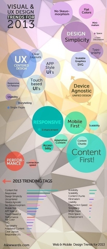
What web design trends do you think we'll see in 2014? I'm betting on more simplicity, more cleanliness, and more focus on smaller screen sizes, among other things.

Marty Note

1. Flat UI - AGREE and general agreement.2. 'Mobile first' - AGREE! & trying to wrestle that pig to ground now with CrowdFunde.3. Yet more scrolling - Agree and coming from mobile too.

4. More HTML5 goodness - Agree.

5. More HTML5 badness - Yes goes hand-in-hand with #4

6. Micro UX - New to me, can't judge yet.

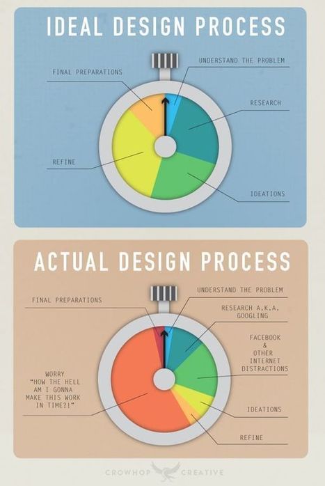
7. Less text - Agree we are moving to the visual web and lean content (more infographics, arresting images and graphics less text)


.8. Minimalist navigation - Agree and this is coming from MOBILE (working CrowdFunde's "mobile first" design right now and navigation is expensive in mobile.


9. CSS replaces images - Agree CSS Canvas is going to make many images needless weight on the page.


10. Video / moving backgrounds - AGREE!


11. Richer content experiences - Agree especially video.


12. Making the most of one page - Agree, but don't agree with single page sites (we aren't there yet).


13. Varied typography - Agree there is a lot happening on the server side with type.


14. Monochromatic design - New to me, but more likely than


15. Hypercolour - Not Sure color is easy to do BAD online and more color can make a mess.


16. Cards / tiles - Fascinating and new to me, read why cards are future of the web

http://insideintercom.io/why-cards-are-the-future-of-the-web/


17. Bigger, better imagery (Agree, cloud caching and CDNs making this possible).


18. Fixed position content / navigation - Agree as social widgets already doing this

Tyler Richendollar's curator insight, March 6, 2014 10:38 AM

Some seriously great design ideas and trends for 2014 and forward.  Really a solid summary of what the web looks like today, and will evolve through. 

Scooped by Martin (Marty) Smith
Scoop.it!

User-centered Design Hero Justin Knecht Interview at HOW Design Live

User-centered Design Hero Justin Knecht Interview at HOW Design Live | Must Design | Scoop.it
Justin Knecht is a proven master of innovation and user-centered design. Don't miss him live with many other A-listers at HOW Design Live 2014, in Boston.
Martin (Marty) Smith's insight:

Great interview and I'm going to pick up "Orbiting The Giant Hairball" since it sounds like a MUST READ :). M

No comment yet.
Scooped by Martin (Marty) Smith
Scoop.it!

8 UI, UX Tips For Amazing Software or Website Development

8 UI, UX Tips For Amazing Software or Website Development | Must Design | Scoop.it
UI & UX are key factors that influence on user behavior. UI & UX solutions can lead to a successful tandem between software development and end-usage experience.
Martin (Marty) Smith's insight:

Design Tips
These tips rock. Very specific and several are new to me. For example, despite my Director of Ecommerce roots I did not know that 40% of purchases on an ecommerce website are impulse buys. These tips help you maximize the impulse and convert visitors to buyers and advocates.

No comment yet.
Scooped by Martin (Marty) Smith
Scoop.it!

25 Simple yet Graceful Website Designs Inspire

25 Simple yet Graceful Website Designs Inspire | Must Design | Scoop.it
Ever thought of trying 25 Simple yet Graceful Website Designs. Experience the wonders of simplicity and uniqueness allowing for easy navigation and faster loading time.
Martin (Marty) Smith's insight:

Love these simple, graceful yet muscular website designs. 

No comment yet.
Scooped by Martin (Marty) Smith
Scoop.it!

20 Examples Of Beauty Killing Conversion In Web Design

20 Examples Of Beauty Killing Conversion In Web Design | Must Design | Scoop.it

Marty Note
I love beautiful websites. They seduce, charm, hypnotize and rarely convert worth a hoot. Conversion is about clear signals and obvious paths (read Krug Don't Make Me Think). I agree mystery plays a role, but every website element must pass the five second rule.

If you can't understand what to do in five seconds neither can your customers and you have infinitely more patience than any customer. Conventions such as large heroes and four columns of products stacked up one on another exist because they work. A "hero" is the largest image on a webpage. 

These examples make for beautiful films, but they sacrifice conversion for beauty. Some websites can afford to sacrifice cash for beauty most want both. Beauty is important. My first website, was created in 1999 (you can see it here: http://scenttrail.blogspot.com/2010/02/martins-first-web-site.html ).


That site created all those years ago could look rougher and more "garage band" than any website I would create today or than the large ecommerce site my team and I managed for seven years when I was a Director of Ecommerce. We had numbers we had to beat every day or seek employment elsewhere :).   

Design and beauty influence trust and trust influences conversion. These 20 examples create a boatload of trust, but frustrate a visitor's desire to invest that trust in action. Don't do that is the best advice I can give you (lol). Don't do that UNLESS your site is art and not commerce.  

No comment yet.