


 Your new post is loading...


Marty Note
Great HuffPost roundup of several important infographics and psychology of color studies. Which ones surprised you? Problem is every website wants ALL of those emotions, but not all at once (lol). Key is picking right color for right content / place on your site.
RED may SUCK as a homepage because it chases people away, but red could ROCK as an accent. Red "buy" buttons have only been beat ONE TIME in thousands of tests we've run. So find the right color conversation and have it at the right time.
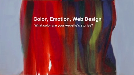
At Curagami (http://www.Curagami.com) we think of colors as ways to help tell stories. We try to "match the hatch" of the story we are telling to colors in our images or within supporting graphics such as icons or widgets.
When our story is EXCITING we like RED or variations of it. We may also isolate the red by using black and white. Isolating red makes its power SHOUT in just the right minimal way sometimes. Too much red makes you want to RELAX so we may follow a RED with a soothing green or blue.
Websites are hub and spoke so it van be impossible to map stories to color in sequence. BUT if you match the PAGE to your colors you can win and be sure to daisy chain content telling the same story with enough similar colors and scenttrail to create a sense of connection. If you tell a GREEN story and suddenly smack your readers with too much red they RUN.
Win the page, link the page and win the psychology of color battle in your web design.
And YES I'm breaking my Big Blogs curation rule for the 3rd time in a day (lol). Soon as you state a stupid rule like that you break it and that is a definite RULE (lol). M
Via Martin (Marty) Smith


add your insight...
Emotion and marketing